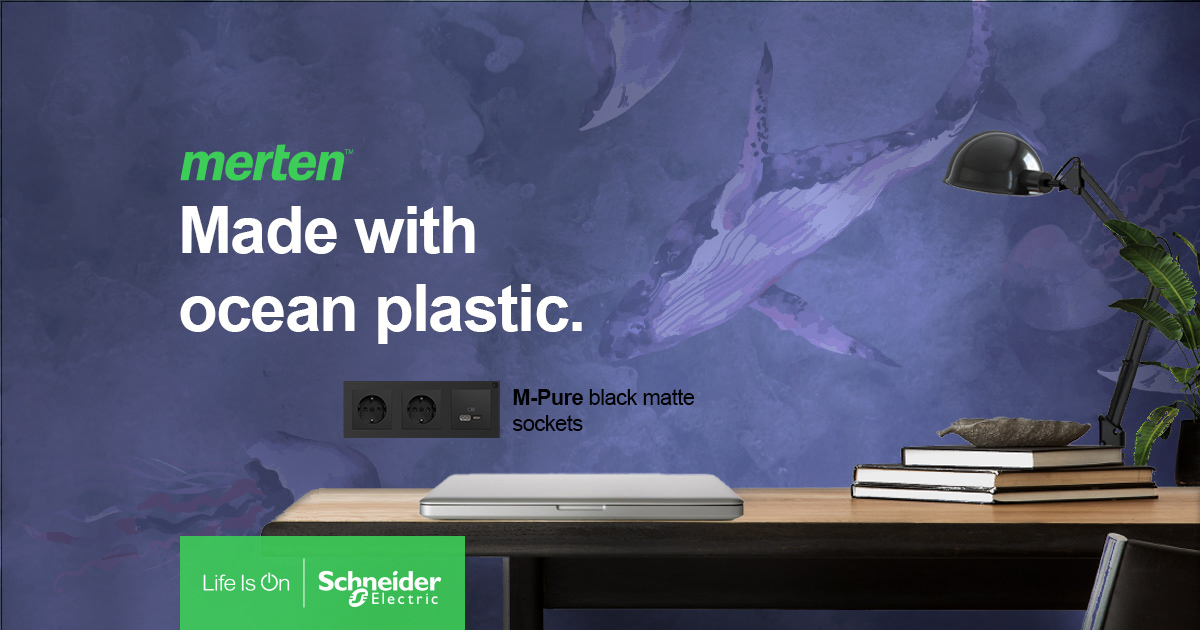
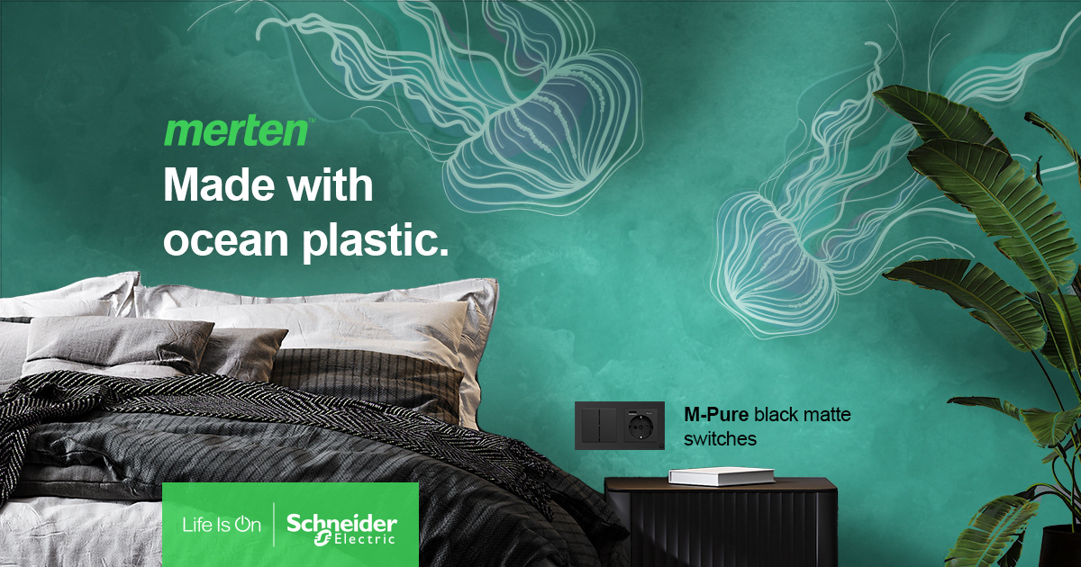
Concept
Below you will see first visual examples for this campaign. Client wanted to mockup product in the interior. To show its story I decided to create a wabi-sabi style wall illustrating ocean animals and fauna. To catch user attention animals are swimming to the switch. For creating deep sea feeling I made some light and shadows layers on the wall and I was using blueish color palette, but I also wanted to include Pantone 2022 color in the design, to showcase that brand is trend-oriented.
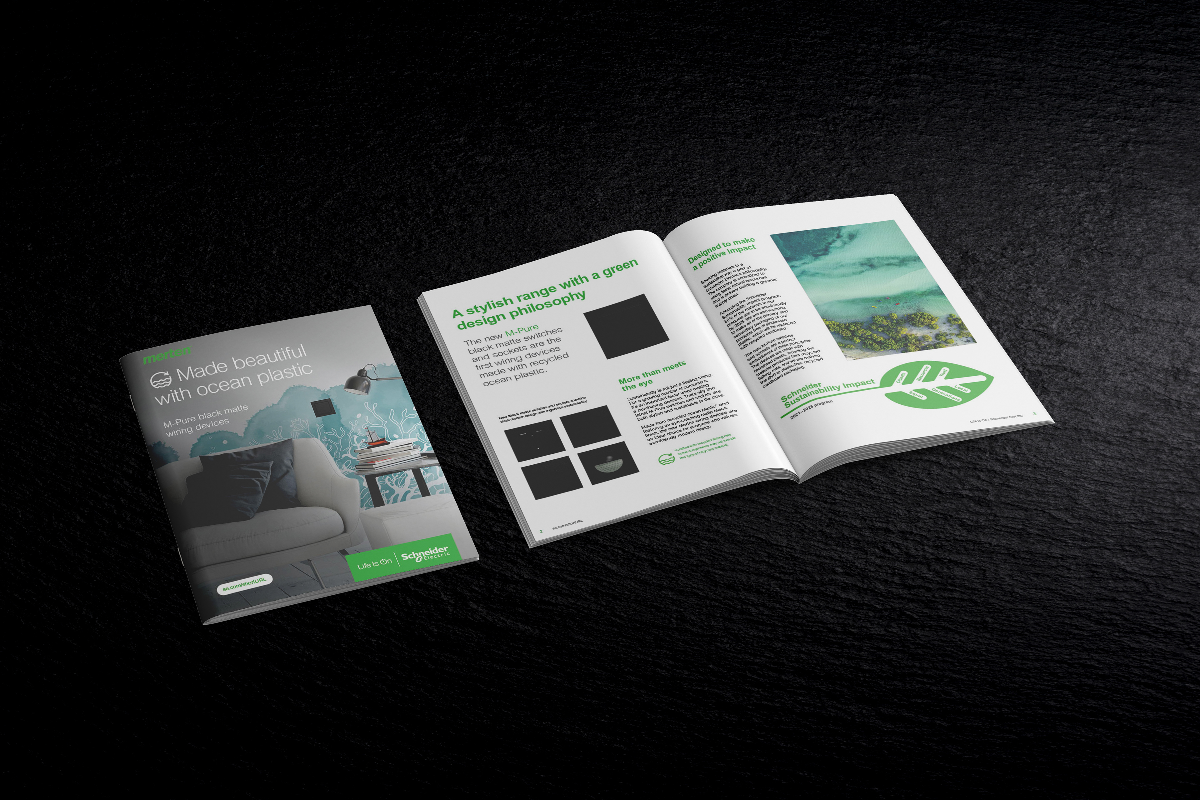
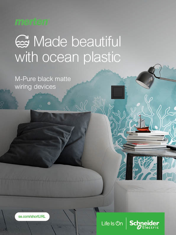
Brochure
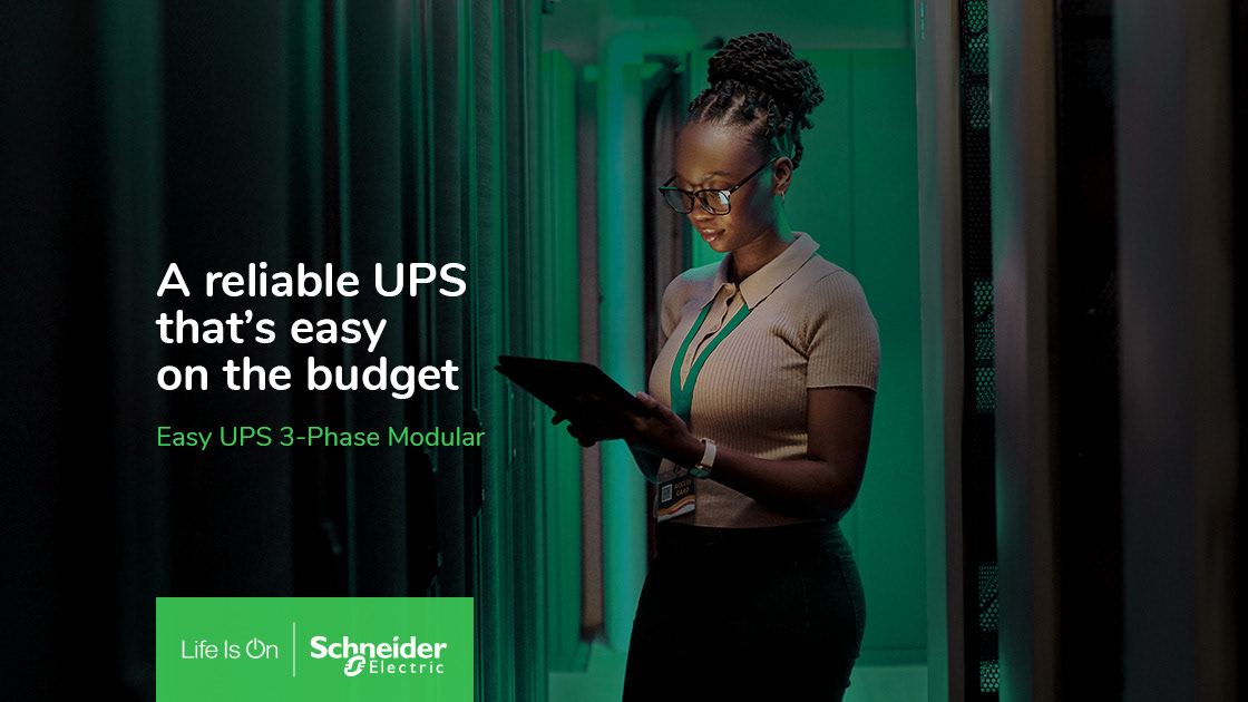
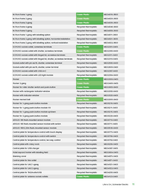
For this project a priority was to explain product story in visually pleasing way, but with included Schneider Electric's brand guidelines. I decided to combine interior ocean key visuals with stock images, which match with visuals color palette and introduce ocean scenery. Black text is combined with SE green elements to highlight headlines and catch user attention on interesting features. For the table I used two tones of grey to make it more clear to read. All brochure includes two styles of fonts from company's brand book.

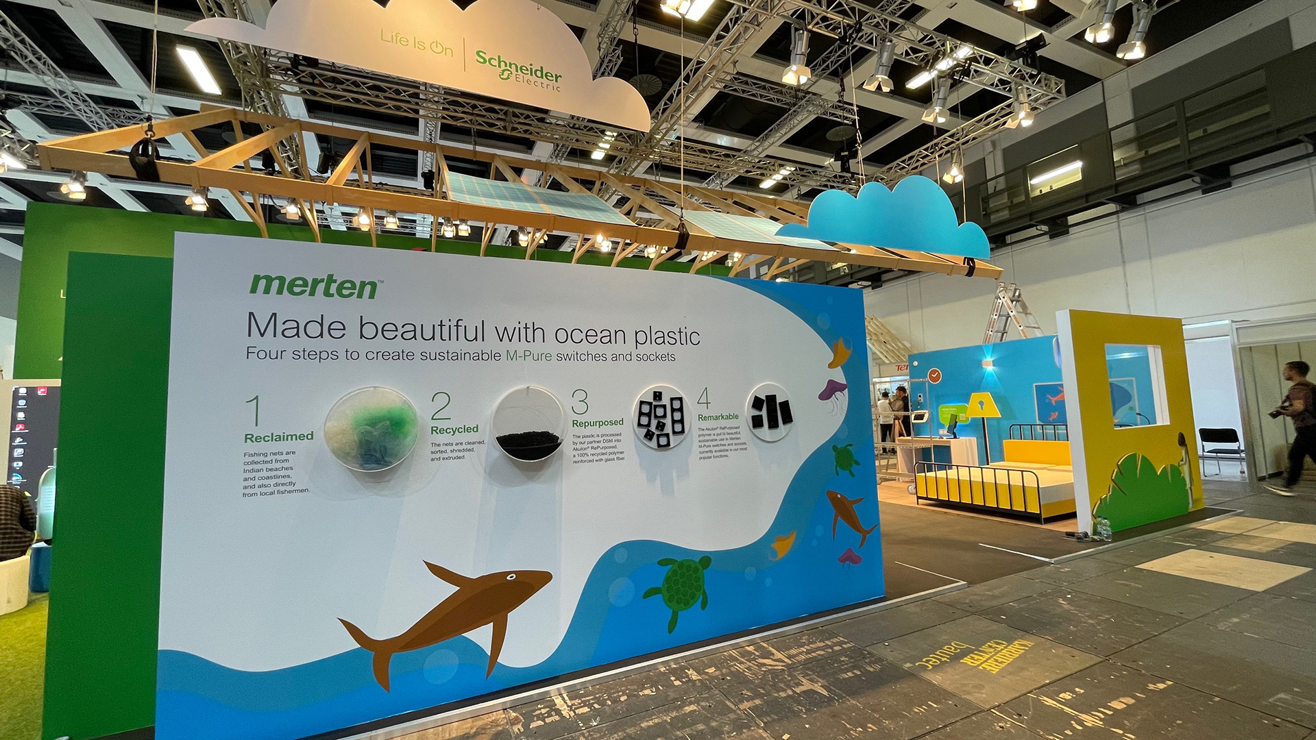
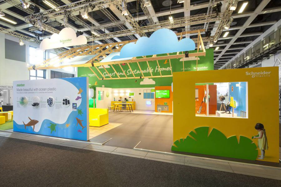
Booth design for CES 2023:
For this project a priority was to explain product story in a simple way and in visual style that matches other parts of brand's installation.
Overall, idea was based on simple cutout shapes in primary colors. I create geometric illustration which match the style of other graphics of installation. To make booth more engaging I decide to not show pictures of each production steps, but to bring real products, so clients can see them and touch. I was inspired with bubble shape. To make it even more outstanding I thought about installing a light under the "bubbles". Black copy is combined with SE green headlines.
Merten Ocean plastic publications
Merten Brochure publication