Overview
Brand Strategy, Visual Identity, Positioning, Creative Direction
Brand Strategy, Visual Identity, Positioning, Creative Direction
POP had outgrown its original identity. Although the company had built a strong reputation through its work, its visual language and positioning no longer reflected the quality, ambition, and scale of the business. The brand lacked a distinctive personality and struggled to communicate its premium value in an increasingly saturated creative market.
The goal was to redefine how POP is perceived.
The Challenge
The challenge was to create a brand that feels contemporary today while remaining timeless over the coming years. The previous identity faced several issues: Generic agency B2C aesthetics with limited memorability; Inconsistent communication across digital touchpoints; Weak emotional differentiation from competitors; No clear visual system that could scale across presentations, social media, campaigns and future products; Positioning focused on services rather than the value POP creates.
Discovery
The rebranding process began with extensive strategic research. Market Analysis where research covered agencies across MENA. The objective was to identify visual patterns, positioning gaps and opportunities to own a more distinctive space.
The rebranding process began with extensive strategic research. Market Analysis where research covered agencies across MENA. The objective was to identify visual patterns, positioning gaps and opportunities to own a more distinctive space.
Brand Audit included: Existing visual identity; Website; Social media; Communication tone; Competitor positioning; Customer perception
Key Insight: Most agencies sell execution. Very few sell perspective. POP had the opportunity to become a brand recognized not only for creating content but for shaping culture and influencing perception.
Creative Concept
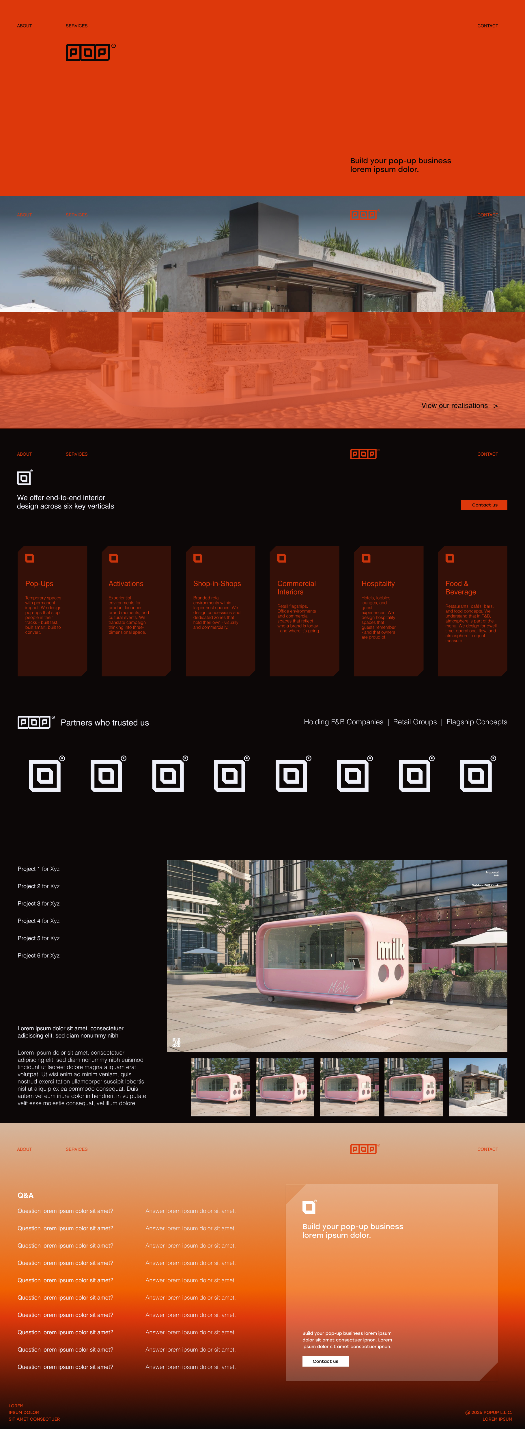
The identity is built around one central idea: Ideas that pop. Rather than treating “POP” literally, the concept interprets it as unexpected moments, creative energy, cultural relevance, visual impact and memorable experiences. The identity creates movement and rhythm instead of relying on decorative elements.
The identity is built around one central idea: Ideas that pop. Rather than treating “POP” literally, the concept interprets it as unexpected moments, creative energy, cultural relevance, visual impact and memorable experiences. The identity creates movement and rhythm instead of relying on decorative elements.
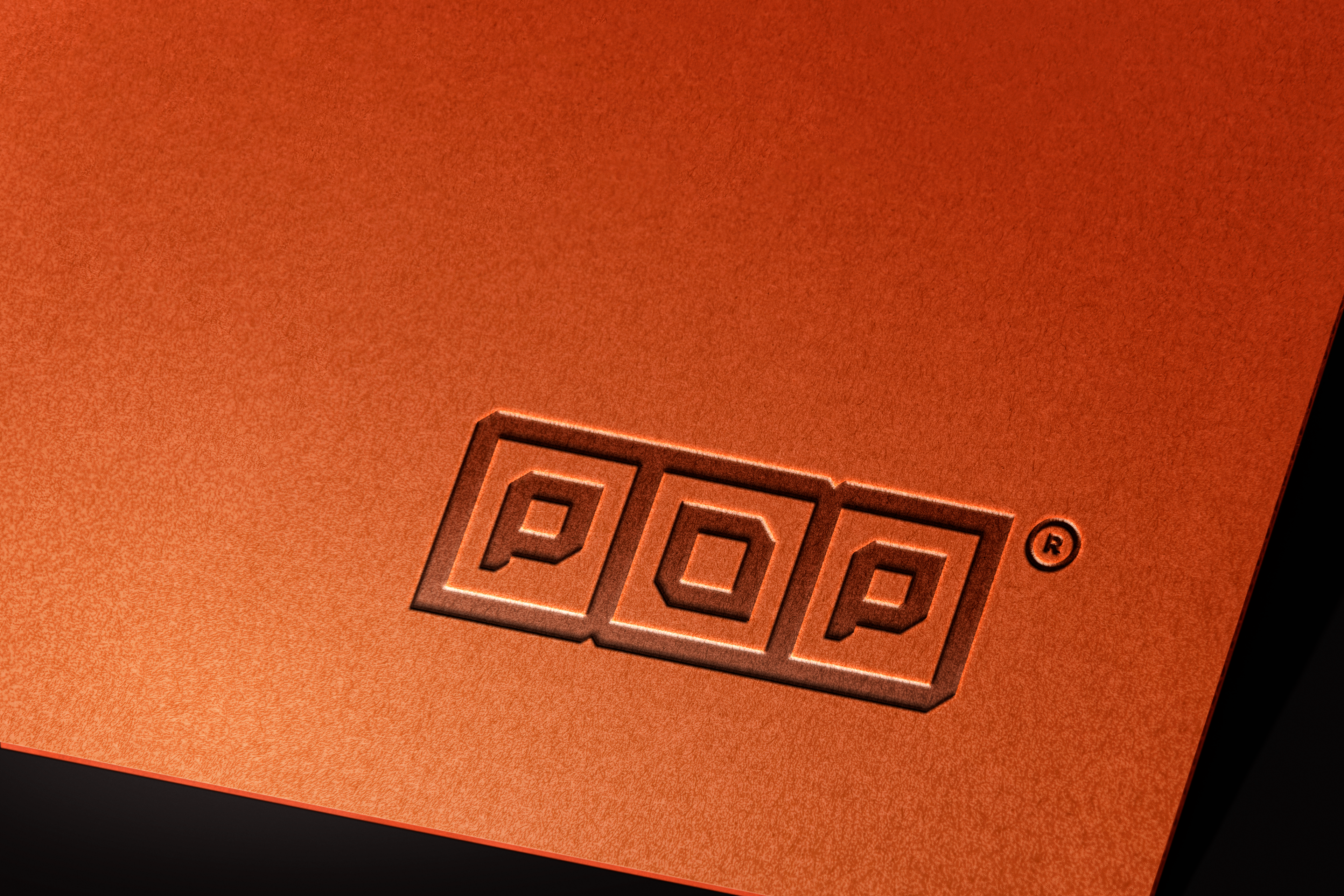
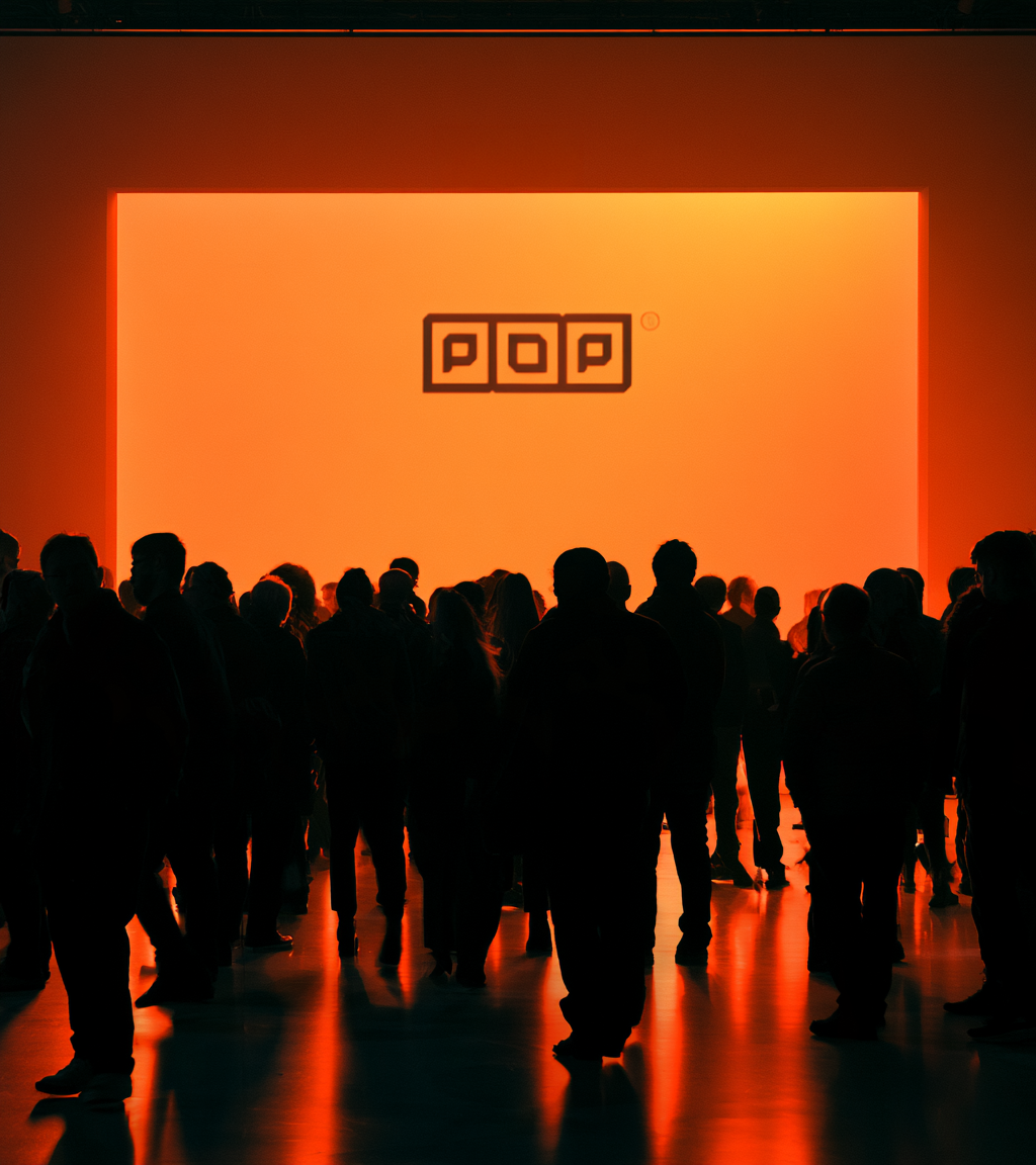
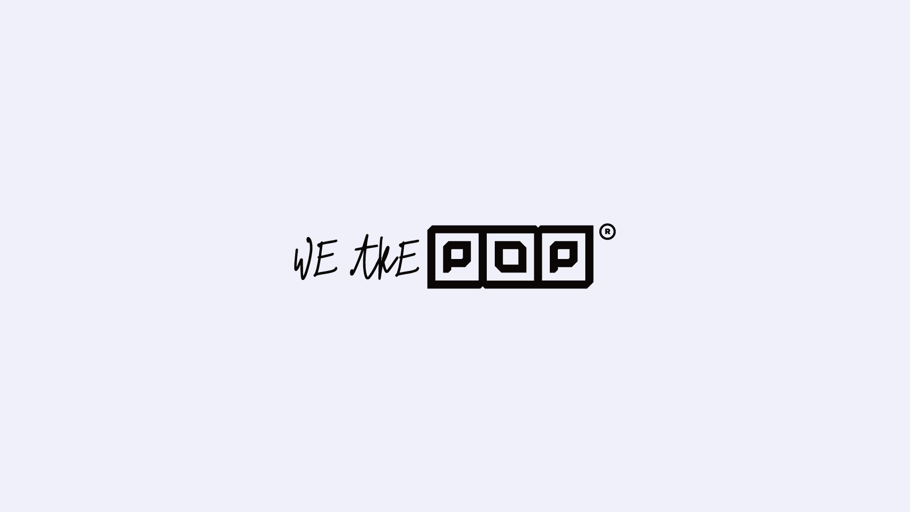
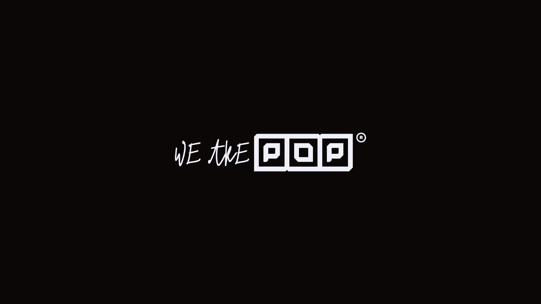
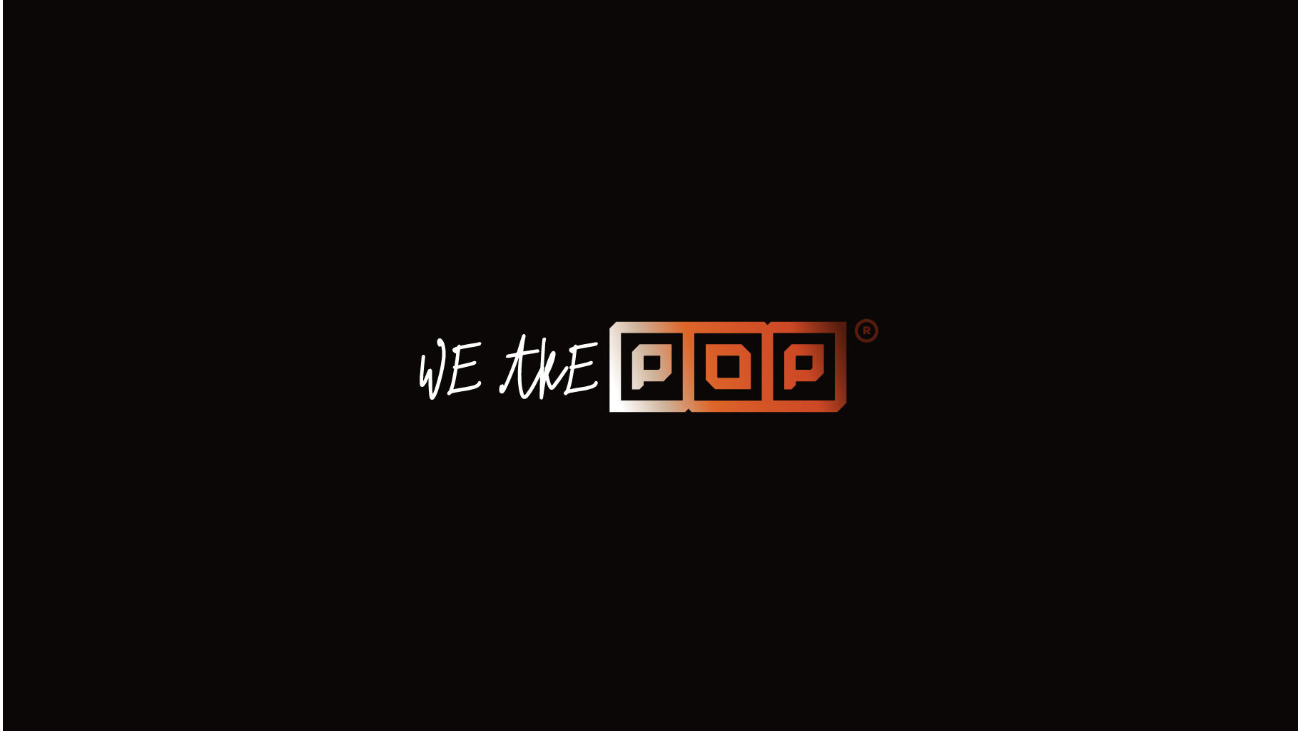
Logo: A refined typographic logo designed for flexibility across digital and physical environments. The logo balances simplicity with personality, allowing it to become instantly recognizable.
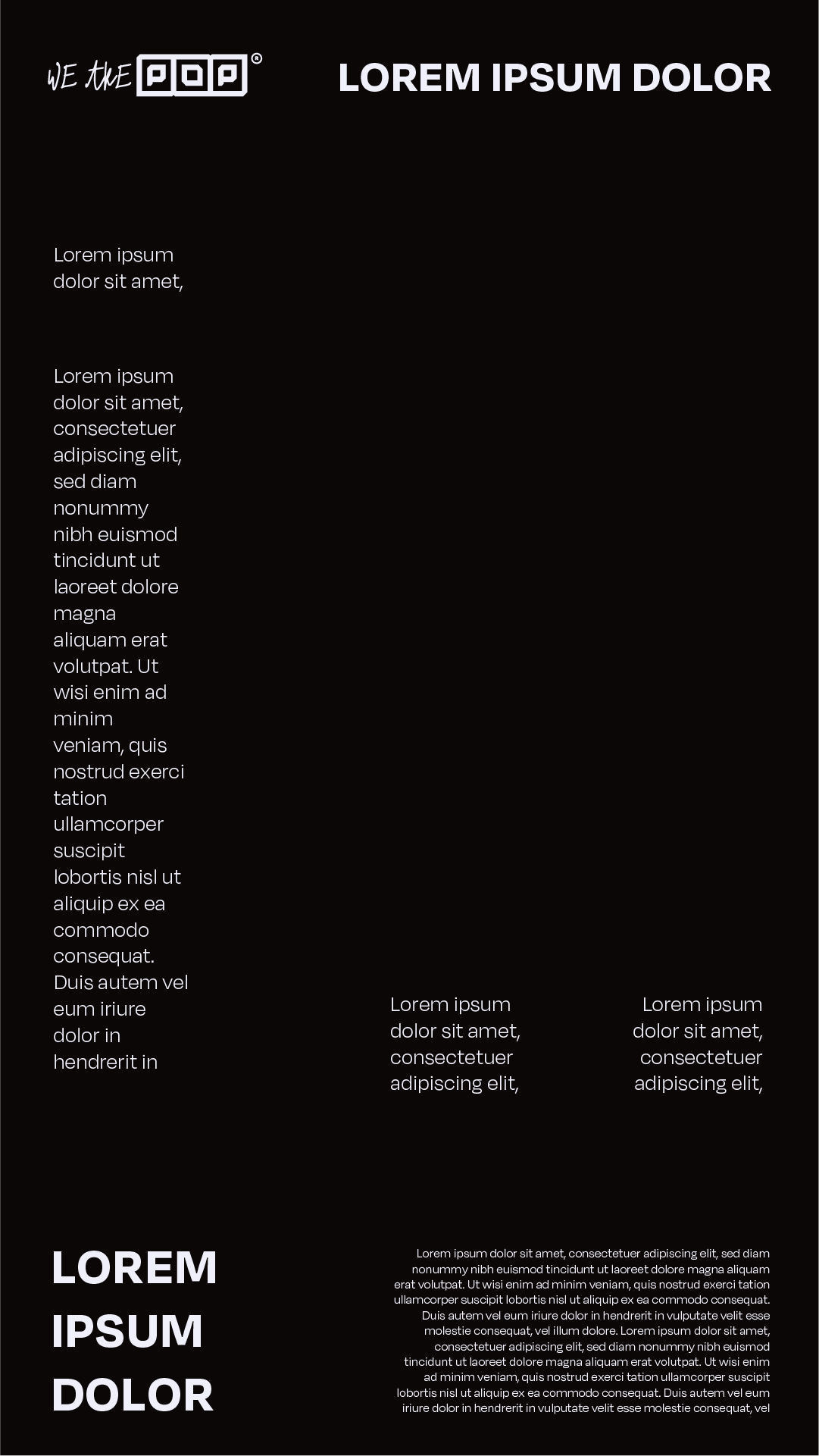
Typography: A modern sans-serif system creates clarity while supporting both editorial layouts and expressive campaign visuals.
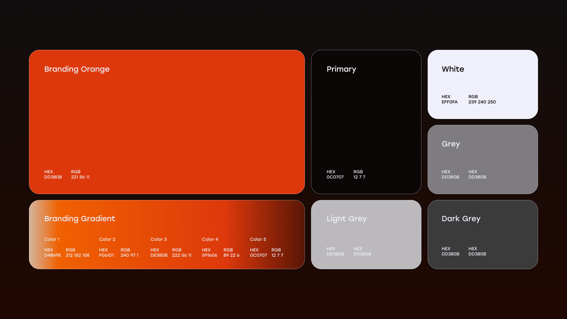
Color Palette: The palette combines confident monochrome foundations with vibrant accent colors inspired by culture and contemporary media. The result feels premium while remaining energetic.

Graphic System
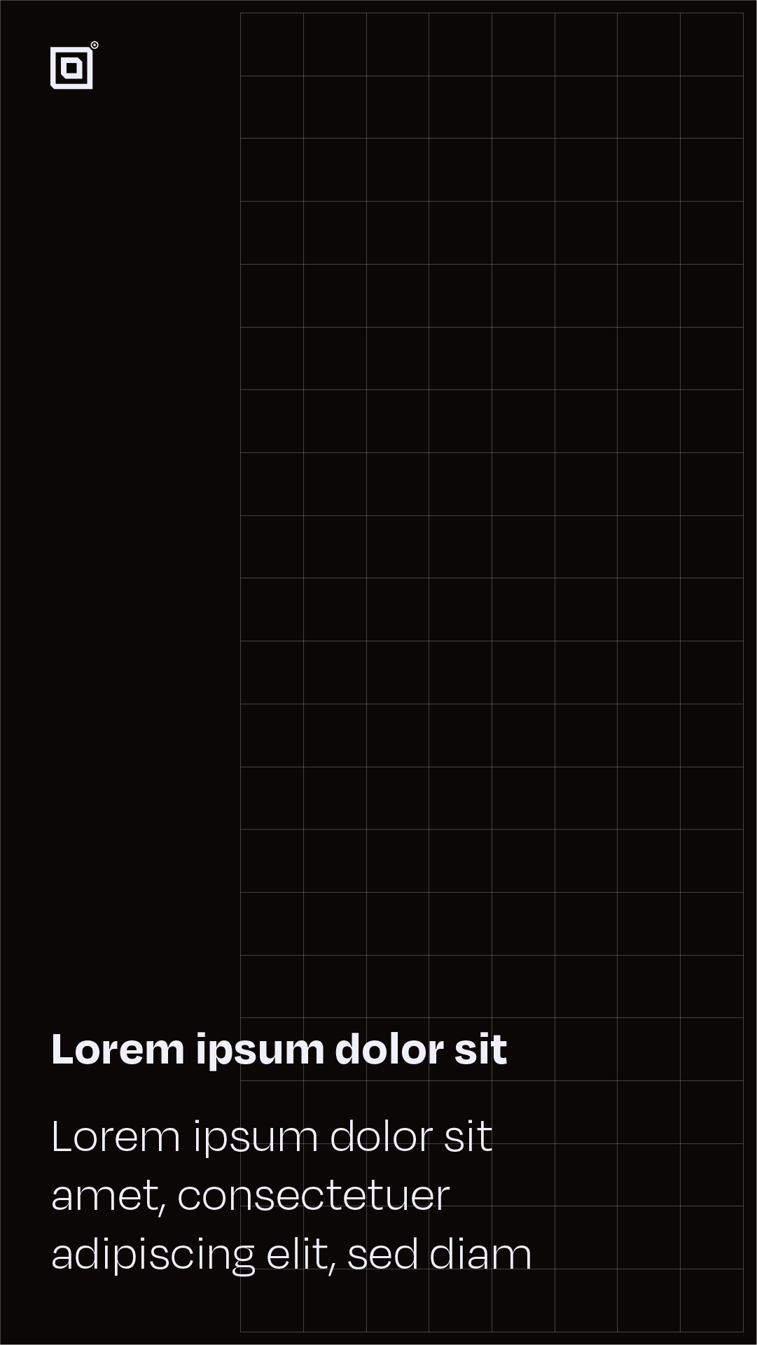
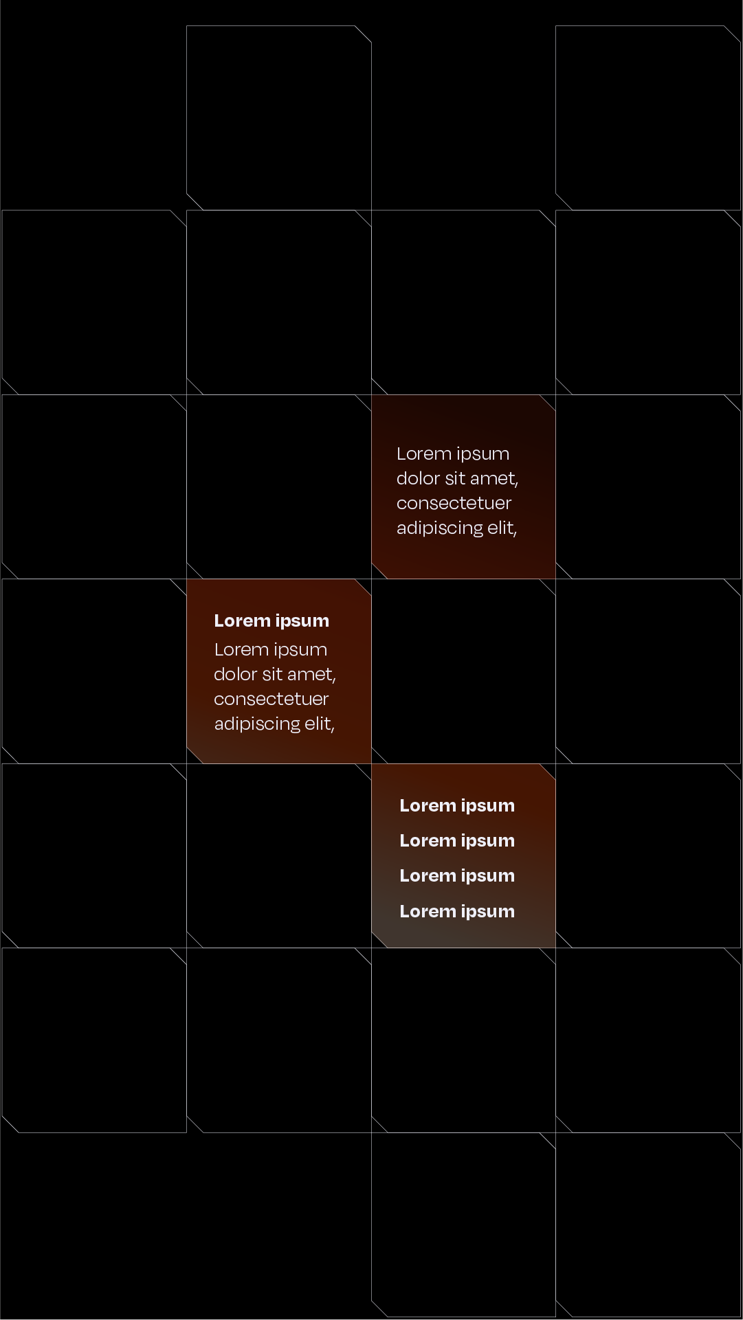
The visual language includes: bold layouts; under and oversized typography; dynamic cropping; modular grids; expressive compositions; gradients and strong use of negative space.
The visual language includes: bold layouts; under and oversized typography; dynamic cropping; modular grids; expressive compositions; gradients and strong use of negative space.
Brand Voice
Communication shifted from describing services toward expressing ideas. The tone became: confident; conversational; insightful; culturally aware; optimistic
Communication shifted from describing services toward expressing ideas. The tone became: confident; conversational; insightful; culturally aware; optimistic









Applications
The new identity was designed as a scalable system across every touchpoint. Including: Website; Social media; Pitch decks; Client presentations; Merchandise; Motion graphics; Brand campaigns; Event materials; Internal documents
The new identity was designed as a scalable system across every touchpoint. Including: Website; Social media; Pitch decks; Client presentations; Merchandise; Motion graphics; Brand campaigns; Event materials; Internal documents
Design Principles
Every creative decision followed four principles: Simple enough to remember; Flexible enough to evolve; Bold enough to stand out; Strategic enough to support business growth.
Every creative decision followed four principles: Simple enough to remember; Flexible enough to evolve; Bold enough to stand out; Strategic enough to support business growth.

Outcome
The rebrand transformed POP from a service-led creative agency into a brand with a distinctive point of view. Instead of competing on execution alone, POP now communicates strategic thinking, cultural awareness and creative leadership. The new identity provides a scalable foundation for future growth while increasing recognition, consistency and perceived value across every customer touchpoint.