Overview
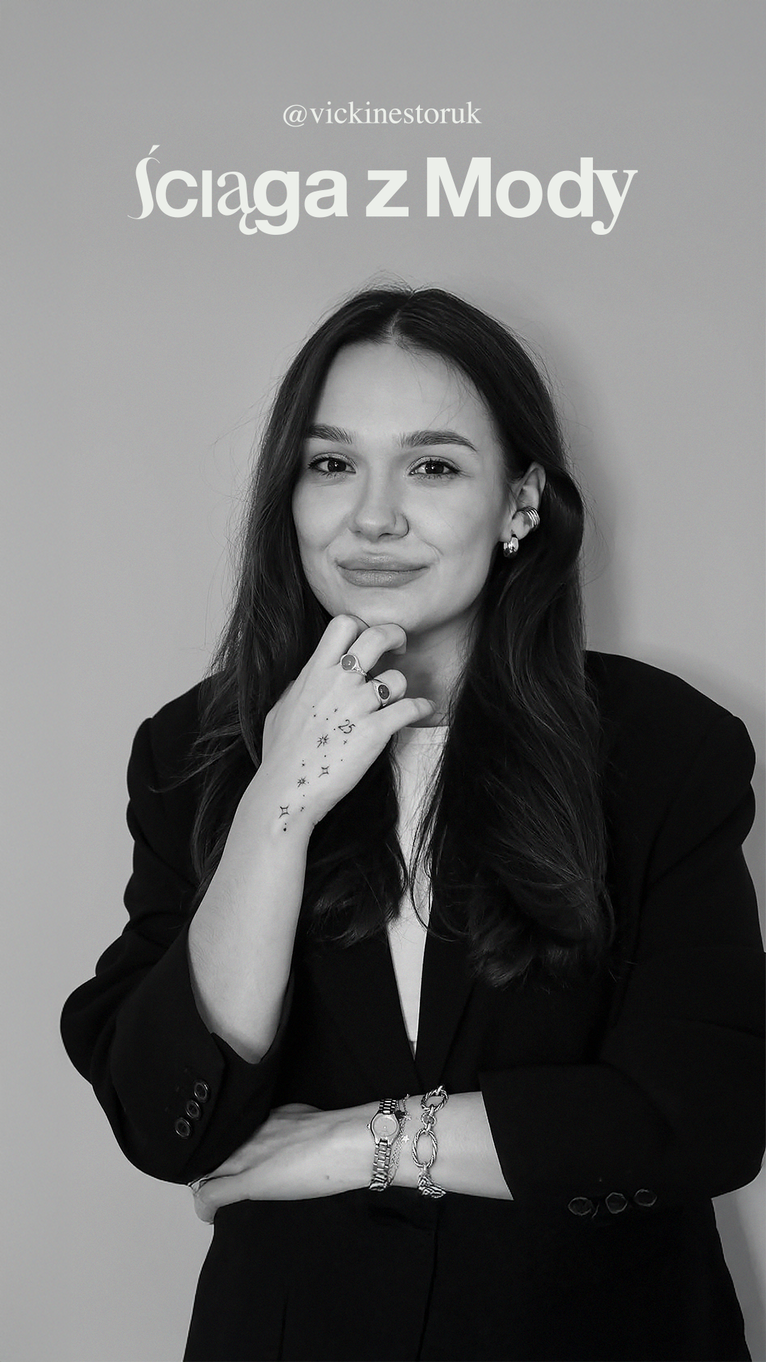
Ściąga z Mody is an expert fashion podcast that combines education, editorial authority, and cultural commentary.
The visual identity is designed to position the podcast as a credible, premium knowledge source, while remaining emotionally engaging and visually distinctive.
The visual identity is designed to position the podcast as a credible, premium knowledge source, while remaining emotionally engaging and visually distinctive.
The system balances editorial classicism, educational clarity, and rock-inspired character, avoiding generic “clean” aesthetics and building a recognizable, long-term visual language.
Fashion as Visual Language
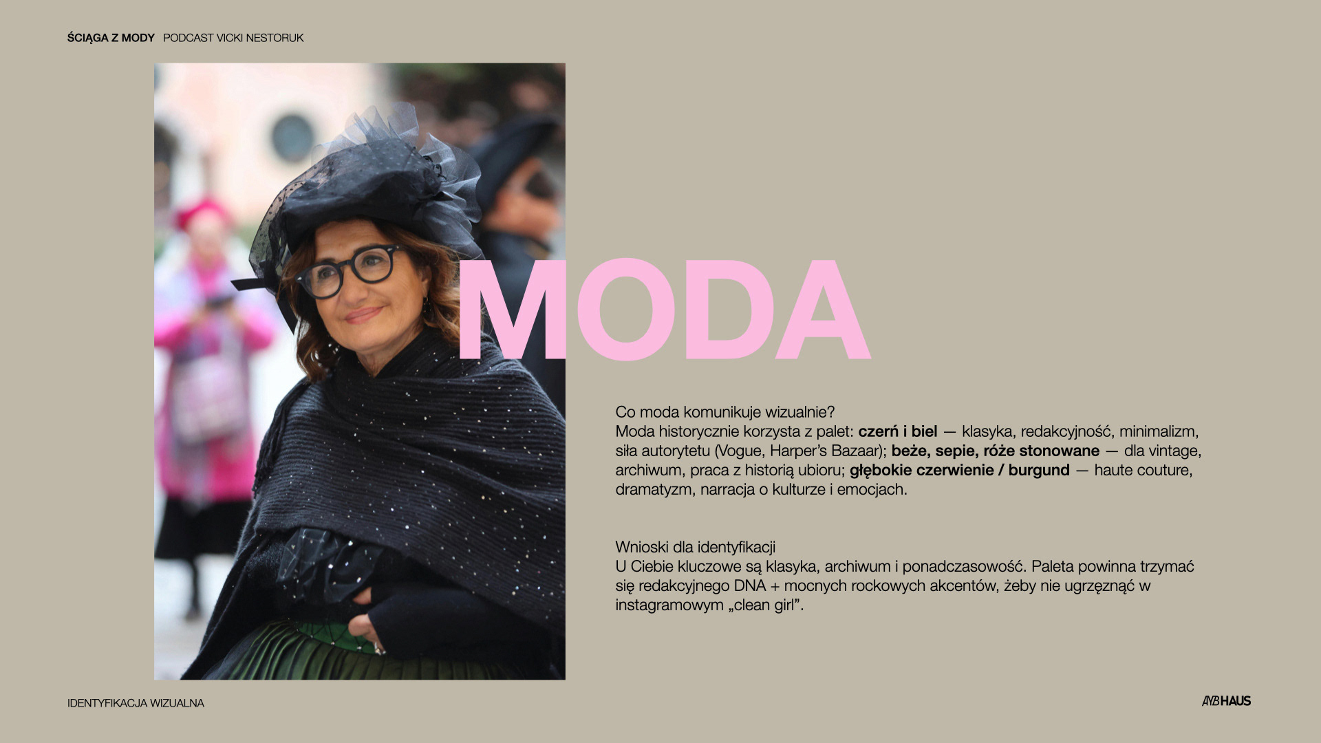
Fashion historically communicates through well-established visual codes:
Black & white – editorial authority, minimalism, cultural capital (Vogue, Harper’s Bazaar)
Beige, sepia, muted pinks – archive, history, craftsmanship
Deep reds / burgundy – haute couture, drama, emotion, narrative
Black & white – editorial authority, minimalism, cultural capital (Vogue, Harper’s Bazaar)
Beige, sepia, muted pinks – archive, history, craftsmanship
Deep reds / burgundy – haute couture, drama, emotion, narrative
Conclusion:
The identity should feel timeless, archival, and editorial, with strong accents that prevent it from becoming sterile or overly Instagram-driven.
The identity should feel timeless, archival, and editorial, with strong accents that prevent it from becoming sterile or overly Instagram-driven.
Education & Psychology of Color
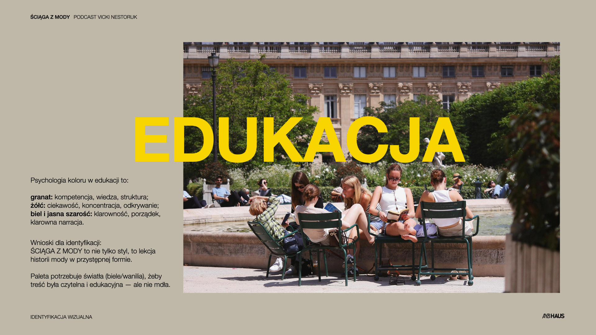
In educational contexts:
Navy / deep blue – competence, structure, trust
Yellow – curiosity, focus, discovery
White / light grey – clarity, readability, order
Navy / deep blue – competence, structure, trust
Yellow – curiosity, focus, discovery
White / light grey – clarity, readability, order
Ściąga z Mody is not only about style, it is a lesson in fashion history, delivered in an accessible format. The palette introduces light and contrast to support comprehension without losing character.
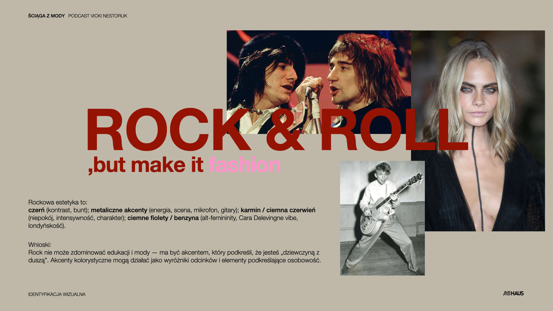
Rock & Roll, but make it fashion
Rock aesthetics introduce:
Black – rebellion, contrast
Metallic accents – energy, stage presence
Crimson / dark red – intensity, emotional depth
Dark purples / petrol tones – alternative femininity, London editorial energy
Black – rebellion, contrast
Metallic accents – energy, stage presence
Crimson / dark red – intensity, emotional depth
Dark purples / petrol tones – alternative femininity, London editorial energy
Role in the system:
Rock is a strategic accent, not a dominant layer.
It adds personality, edge, and emotional charge while preserving authority and readability.
Rock is a strategic accent, not a dominant layer.
It adds personality, edge, and emotional charge while preserving authority and readability.
Strategic Principle:
Consistency with Creative Freedom
With a wide thematic range and long-term growth potential, the identity system is built to:
Allow experimentation with color and composition
Maintain visual consistency across platforms
Support professional partnerships and sponsorships
Allow experimentation with color and composition
Maintain visual consistency across platforms
Support professional partnerships and sponsorships
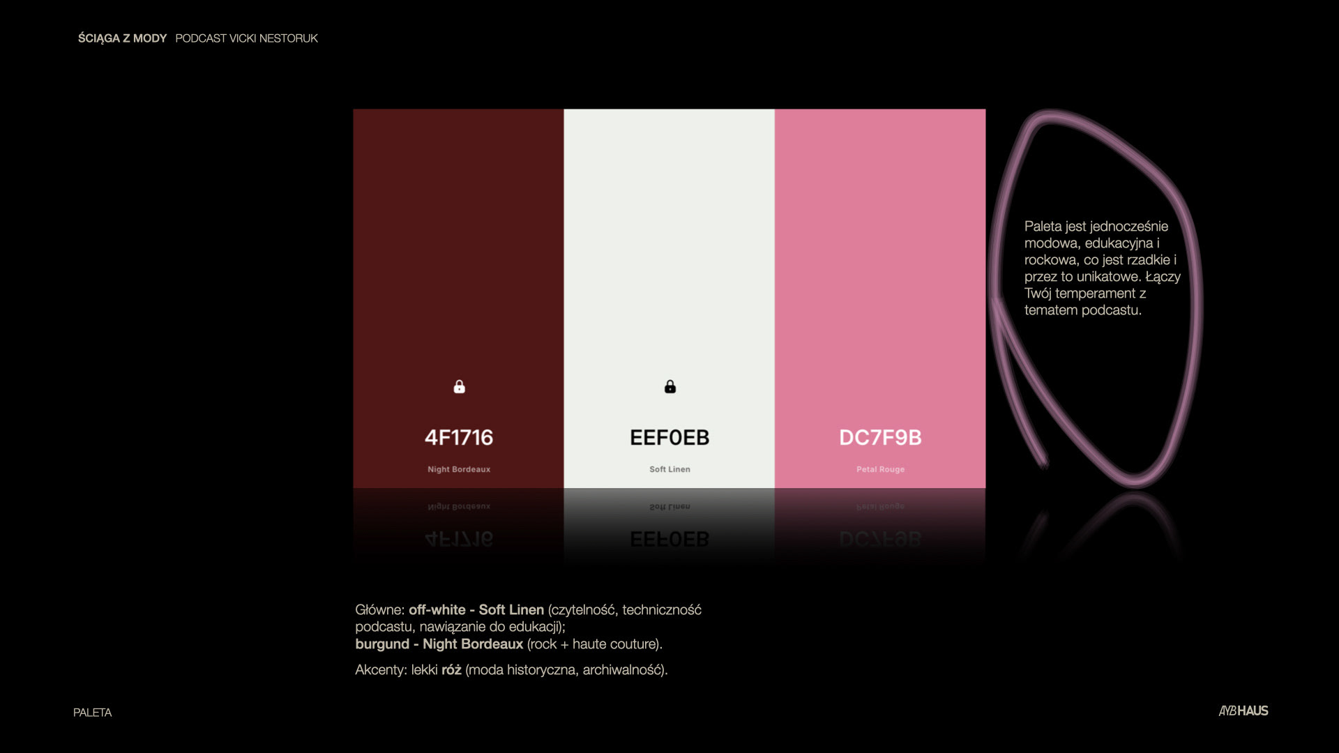
Color Palette:
Primary colors
Soft Linen (off-white) – clarity, editorial neutrality, educational tone
Night Bordeaux (burgundy) – fashion authority, rock influence, emotional depth
Soft Linen (off-white) – clarity, editorial neutrality, educational tone
Night Bordeaux (burgundy) – fashion authority, rock influence, emotional depth
Accent
Muted pink – archival references, historical fashion context
Muted pink – archival references, historical fashion context
The palette is simultaneously: Editorial, Educational, Fashion-driven
This combination is rare and deliberately distinctive.
This combination is rare and deliberately distinctive.
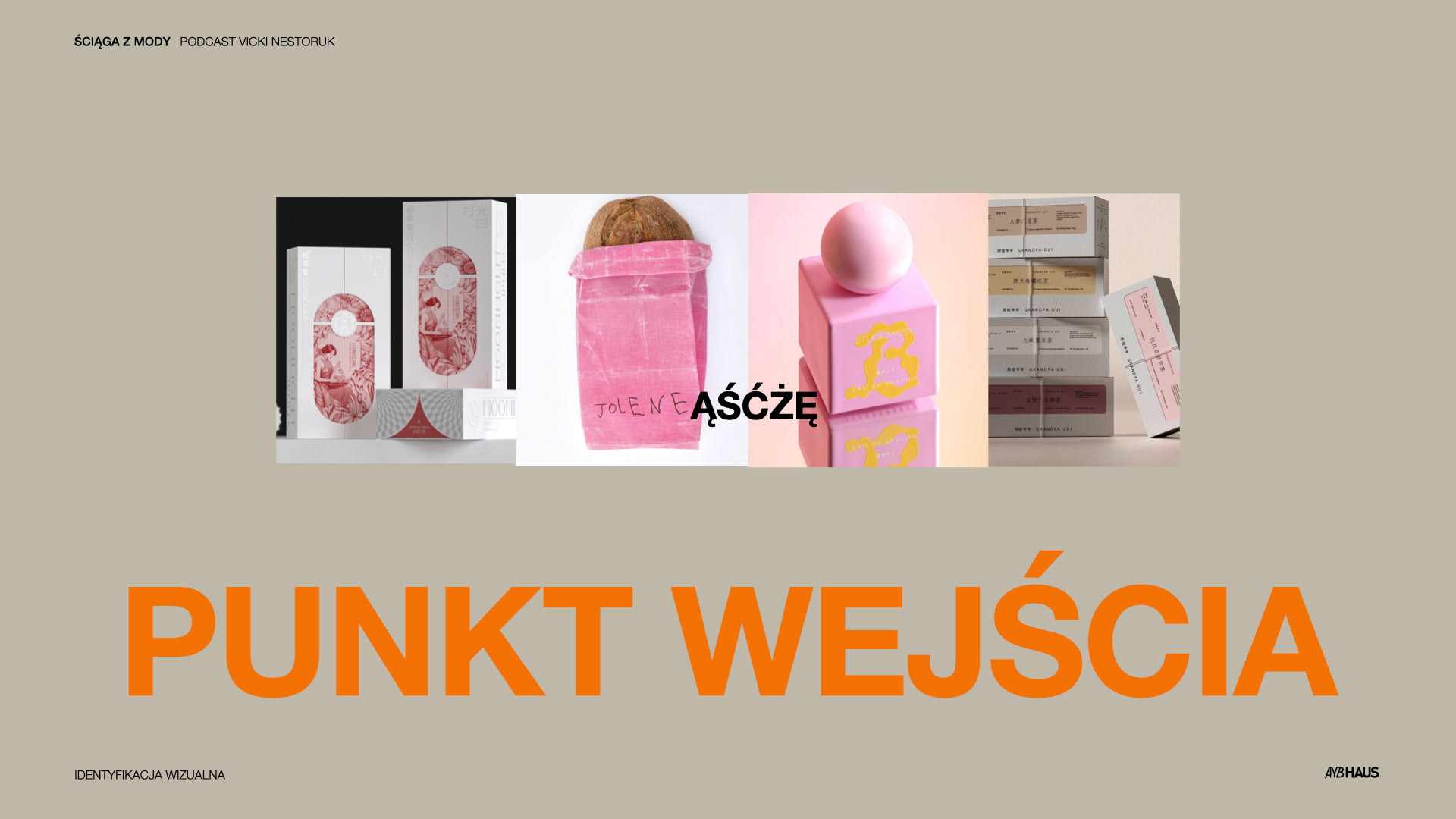
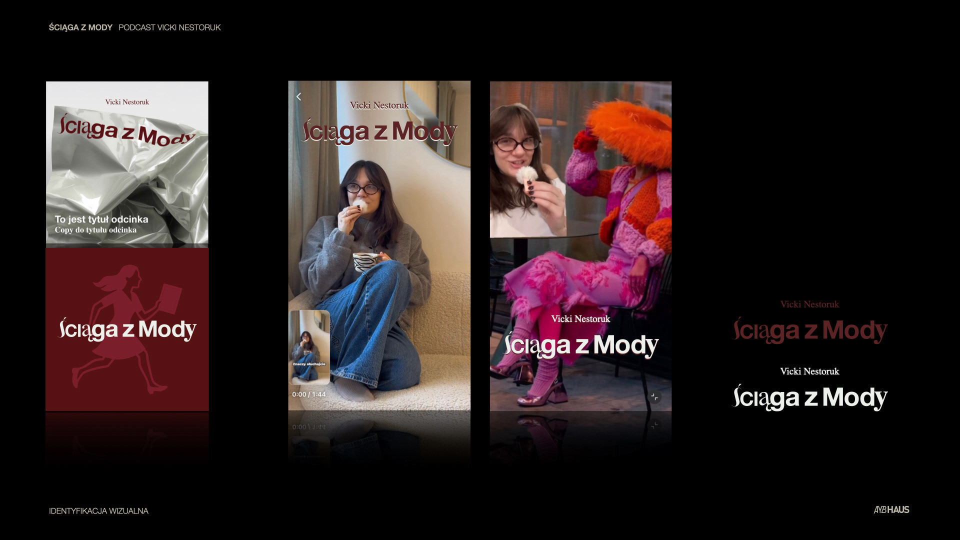
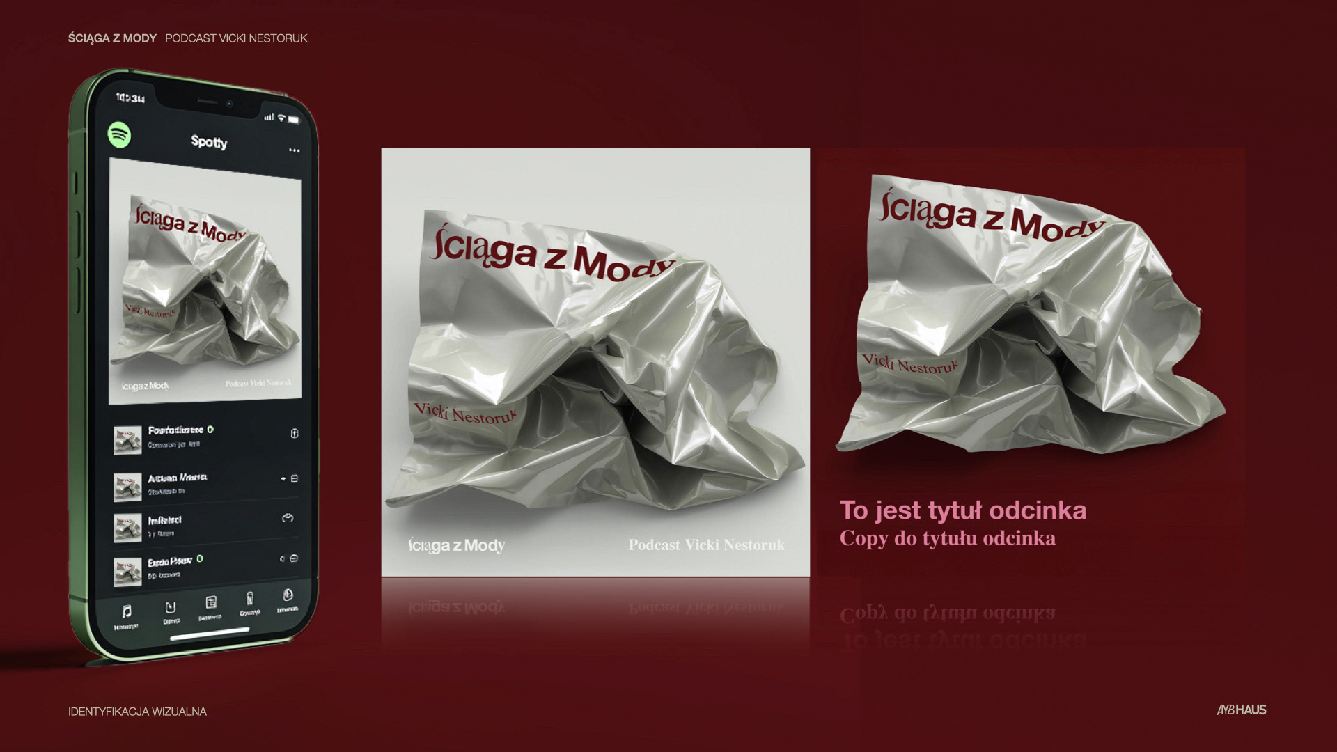
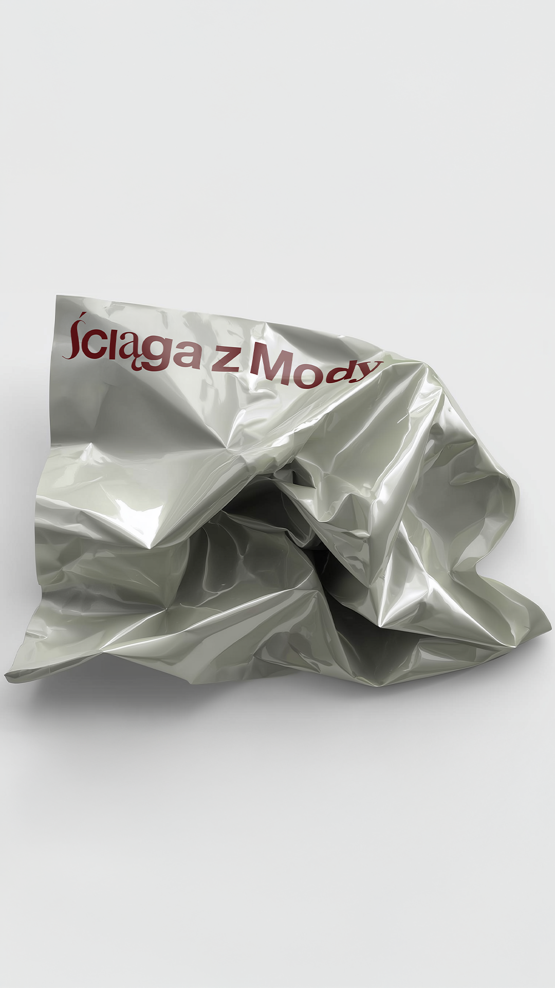
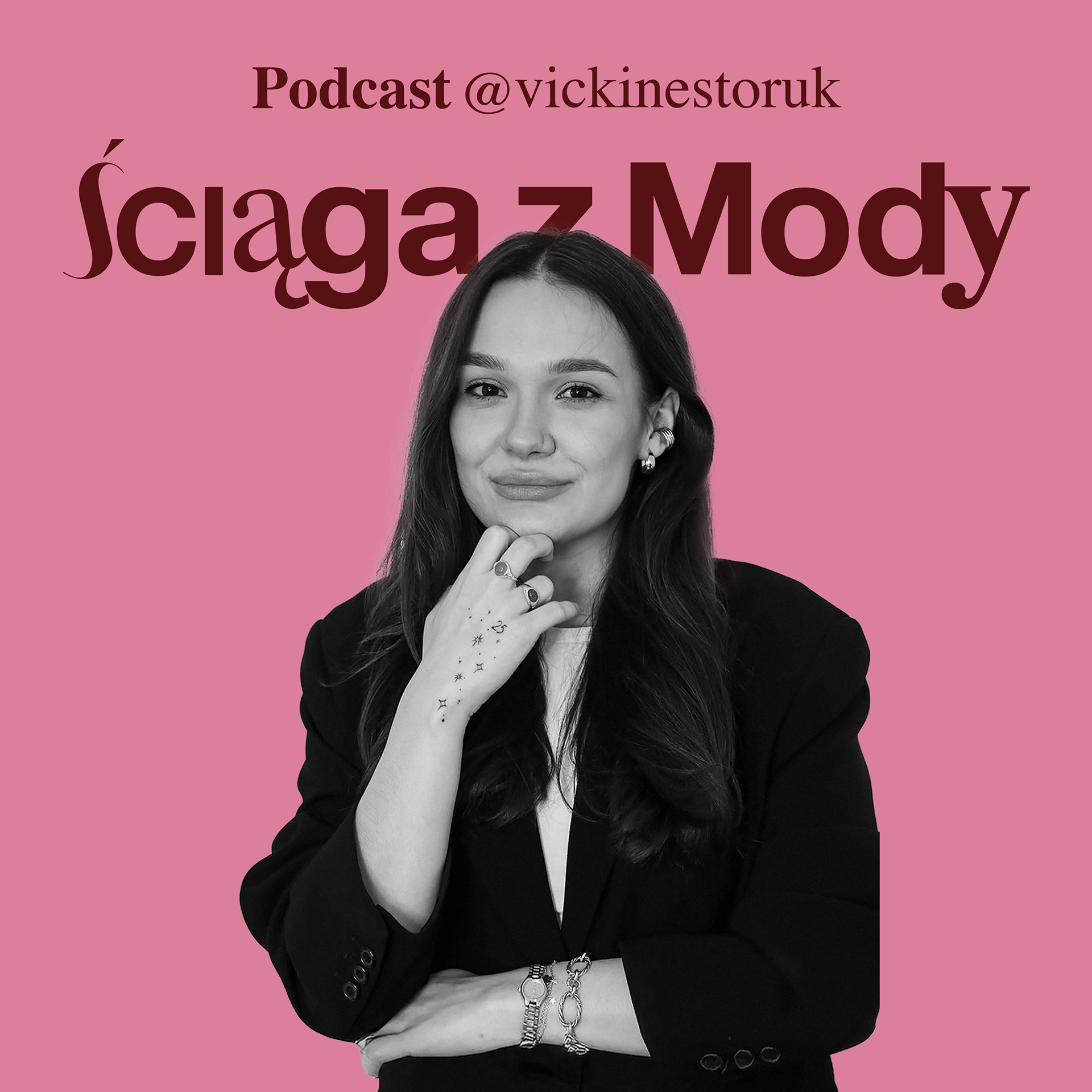
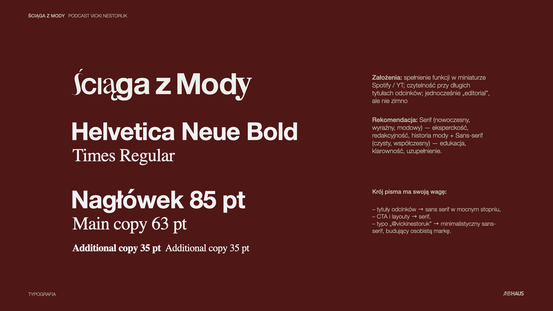
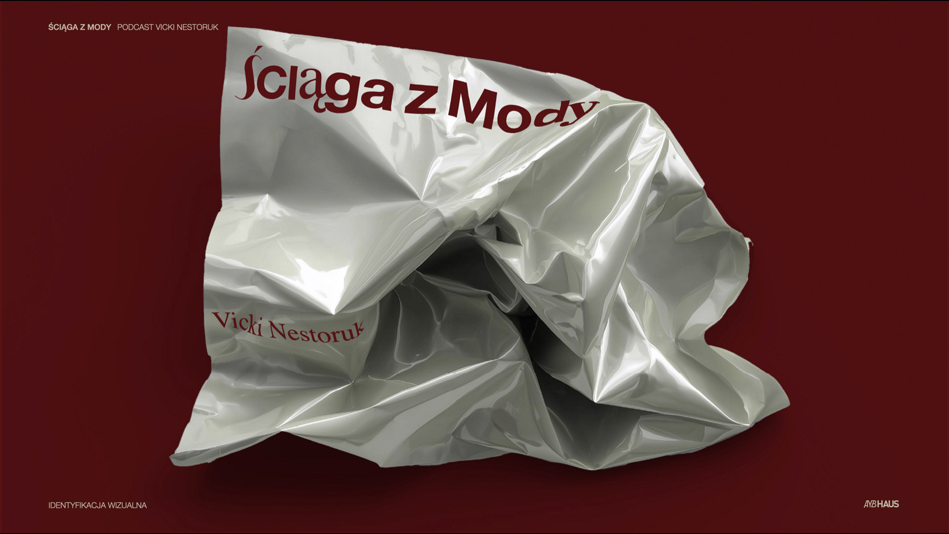
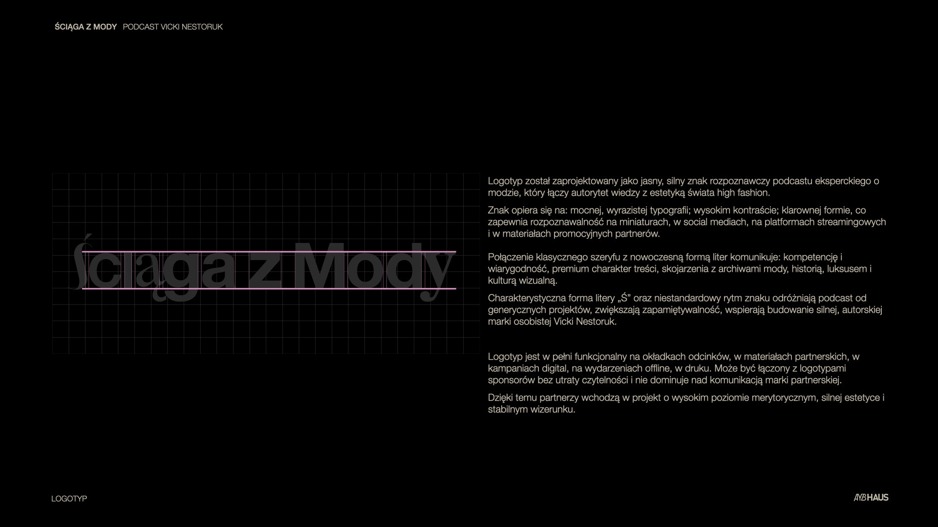
Logo Concept:
The logotype is designed as a strong, clear mark for an expert fashion podcast, combining knowledge authority with high-fashion aesthetics.
Key characteristics:
High contrast
Strong, expressive typography
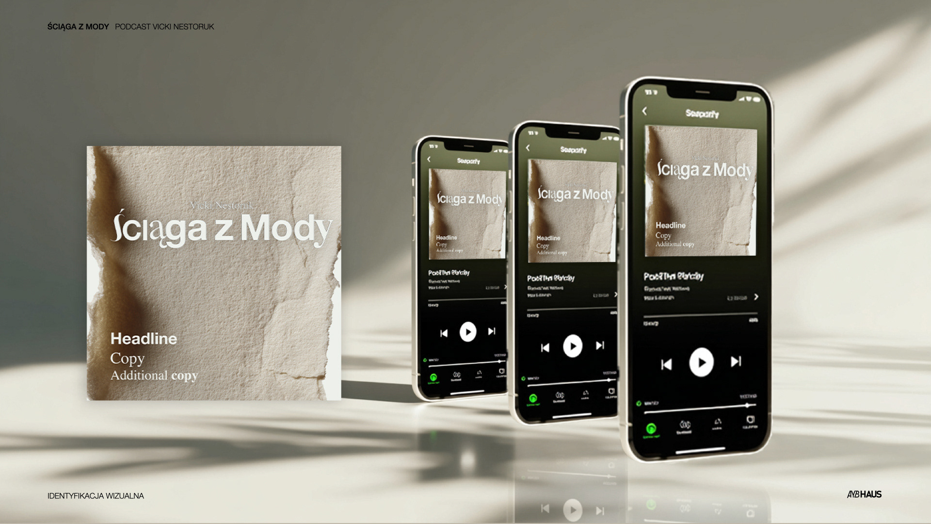
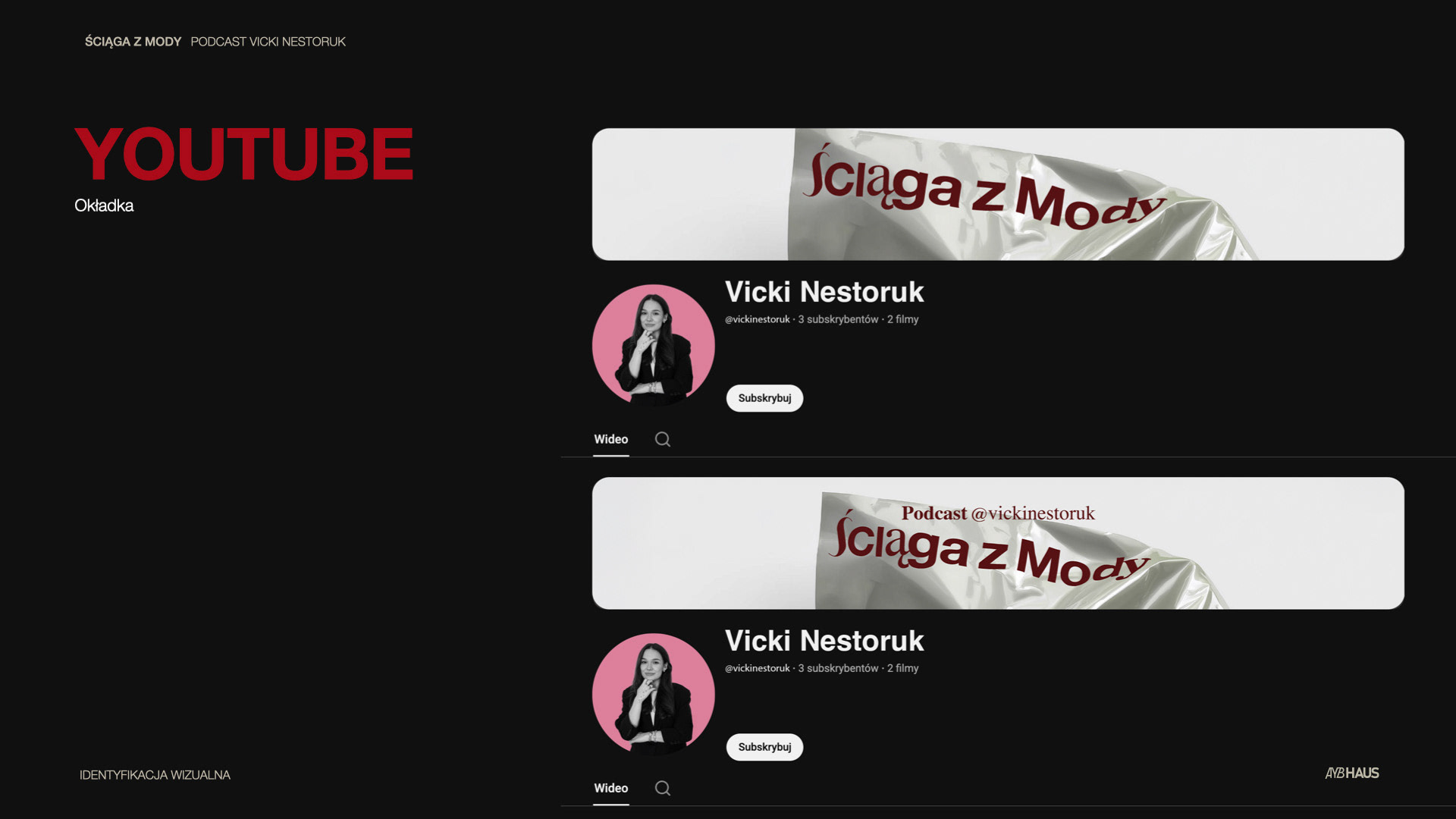
Excellent legibility at small sizes (Spotify, YouTube, social thumbnails)
High contrast
Strong, expressive typography
Excellent legibility at small sizes (Spotify, YouTube, social thumbnails)
The blend of classic serif and modern typographic rhythm communicates:
Competence and credibility, Premium editorial quality, References to fashion archives, history, and cultural depth. The distinctive form of the letter “Ś” and the non-standard rhythm make the logo memorable and clearly differentiated from generic podcast branding.
Competence and credibility, Premium editorial quality, References to fashion archives, history, and cultural depth. The distinctive form of the letter “Ś” and the non-standard rhythm make the logo memorable and clearly differentiated from generic podcast branding.
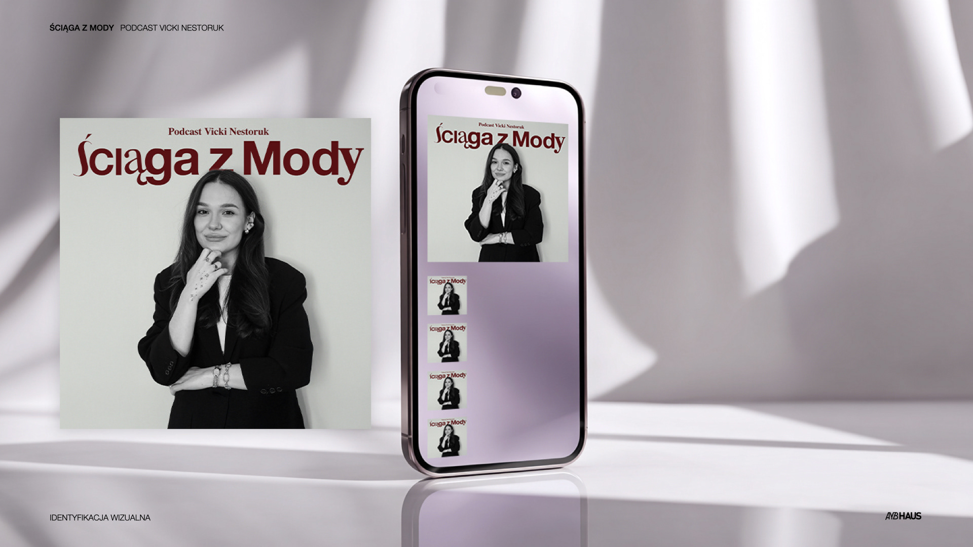
The logo works seamlessly: on episode covers, In partner materials, In digital campaigns, In print and offline activations, It can coexist with sponsor logos without overpowering them.
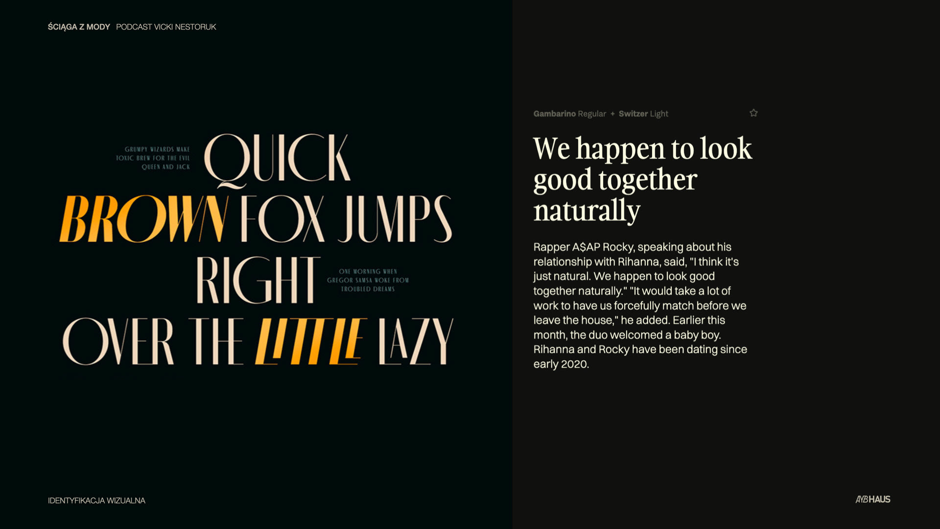
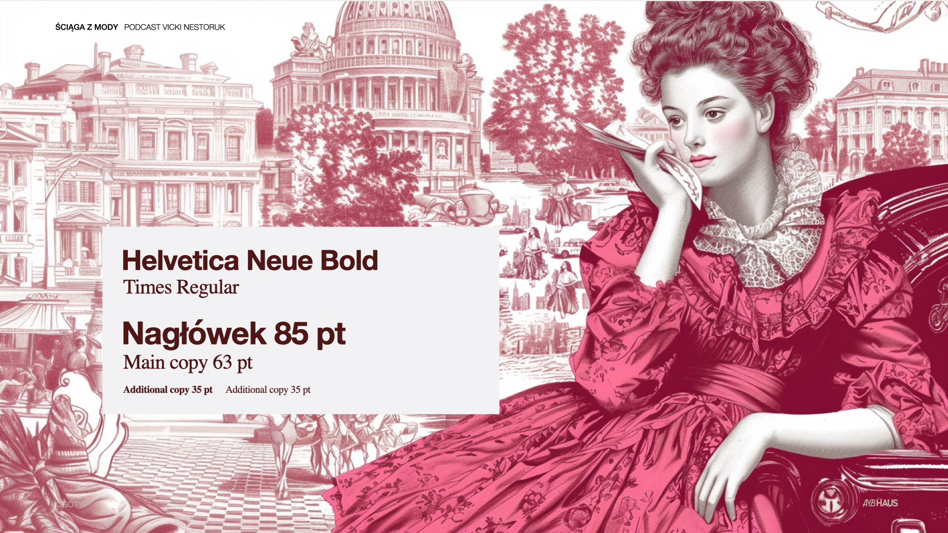
Typography System:
Roles & hierarchy
Episode titles → strong sans-serif (clarity, impact)
CTAs and editorial layouts → serif (authority, fashion context)
Personal handle typography → minimalist sans-serif (personal brand clarity)
Episode titles → strong sans-serif (clarity, impact)
CTAs and editorial layouts → serif (authority, fashion context)
Personal handle typography → minimalist sans-serif (personal brand clarity)
Design goals:
Full readability on Spotify & YouTube thumbnails
Works with long episode titles
Editorial, but not cold
Works with long episode titles
Editorial, but not cold
Typography balance
Serif → expertise, fashion history, editorial depth
Sans-serif → education, clarity, modernity
Sans-serif → education, clarity, modernity
Composition & Layout:
Text flows left to right for clarity and consistency
Centered text is used only for short phrases and paired with minimal graphic elements
The system supports flexible compositions without visual chaos
Platform Applications
Centered text is used only for short phrases and paired with minimal graphic elements
The system supports flexible compositions without visual chaos
Platform Applications
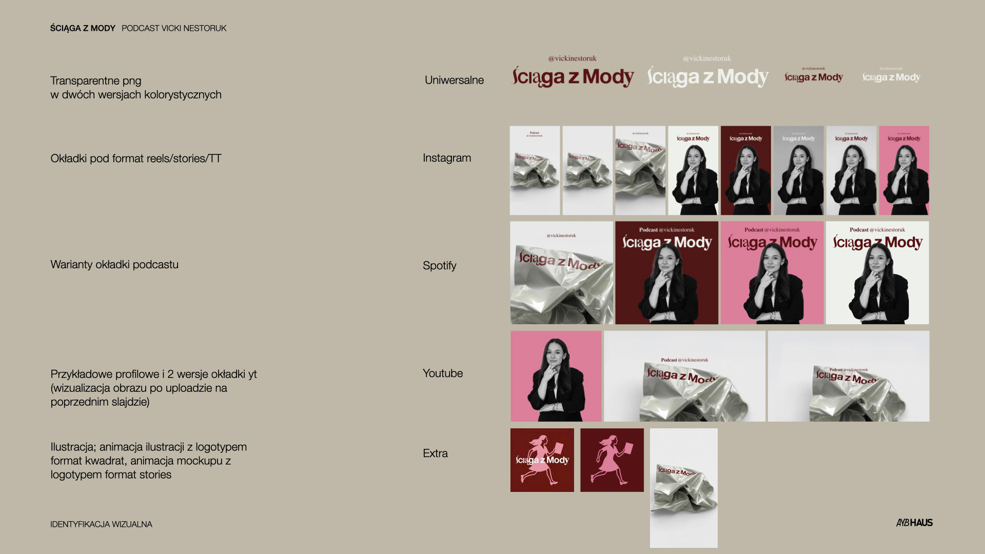
The identity system is fully scalable across: Podcast covers, Spotify & YouTube interfaces, Instagram (posts, Reels, Stories), Promotional materials, Merchandise and print assets
Closing
Ściąga z Mody is positioned as a trusted educational fashion voice with editorial credibility and a distinctive, slightly rebellious personality.
Deliverables included:
Episode cover variants, YouTube thumbnails, Social media formats, PNG, SVG logotype and assets, animated logo and illustration.