Brand Name
By creating a strong and distinctive brand name, platform can establish a sense of trust and credibility with its users, making it more likely that they will engage with the platform and achieve their educational goals.
Teachera is clear and concise, which can help users easily understand what the brand offers. The name immediately conveys that the platform is focused on education and teaching, making it easy for users to identify whether the platform is relevant to their needs. Teachera is memorable and unique, which can help the brand stand out from competitors. Teachera is easy to pronounce and spell, which can help users remember the brand and search for it online. A name that is difficult to pronounce or spell can create frustration for users and make it harder for them to find the platform online.
The use of the suffix "-era" adds a distinctive flair to the name, while also suggesting that the platform is forward-thinking and innovative. "-era" convey a sense of progress and evolution, suggesting that Teachera is a forward-thinking and innovative platform that is constantly adapting to the changing needs of the educational landscape. Teachera is a platform that focuses on helping educators develop and advance their teaching careers. The use of the suffix "-era" convey a sense of professionalism and expertise, suggesting that Teachera is a platform that is dedicated to providing high-quality educational resources and support.
In terms of use mostly for HR and social media, the suffix "-era" can be interpreted as a reference to a community or movement. In this context, the name Teachera can suggest that the platform is focused on building a community of educators and learners who share a common goal of improving education. The use of the suffix "-era" can also convey a sense of belonging and empowerment, suggesting that Teachera is a platform that is dedicated to empowering educators and learners to achieve their full potential.
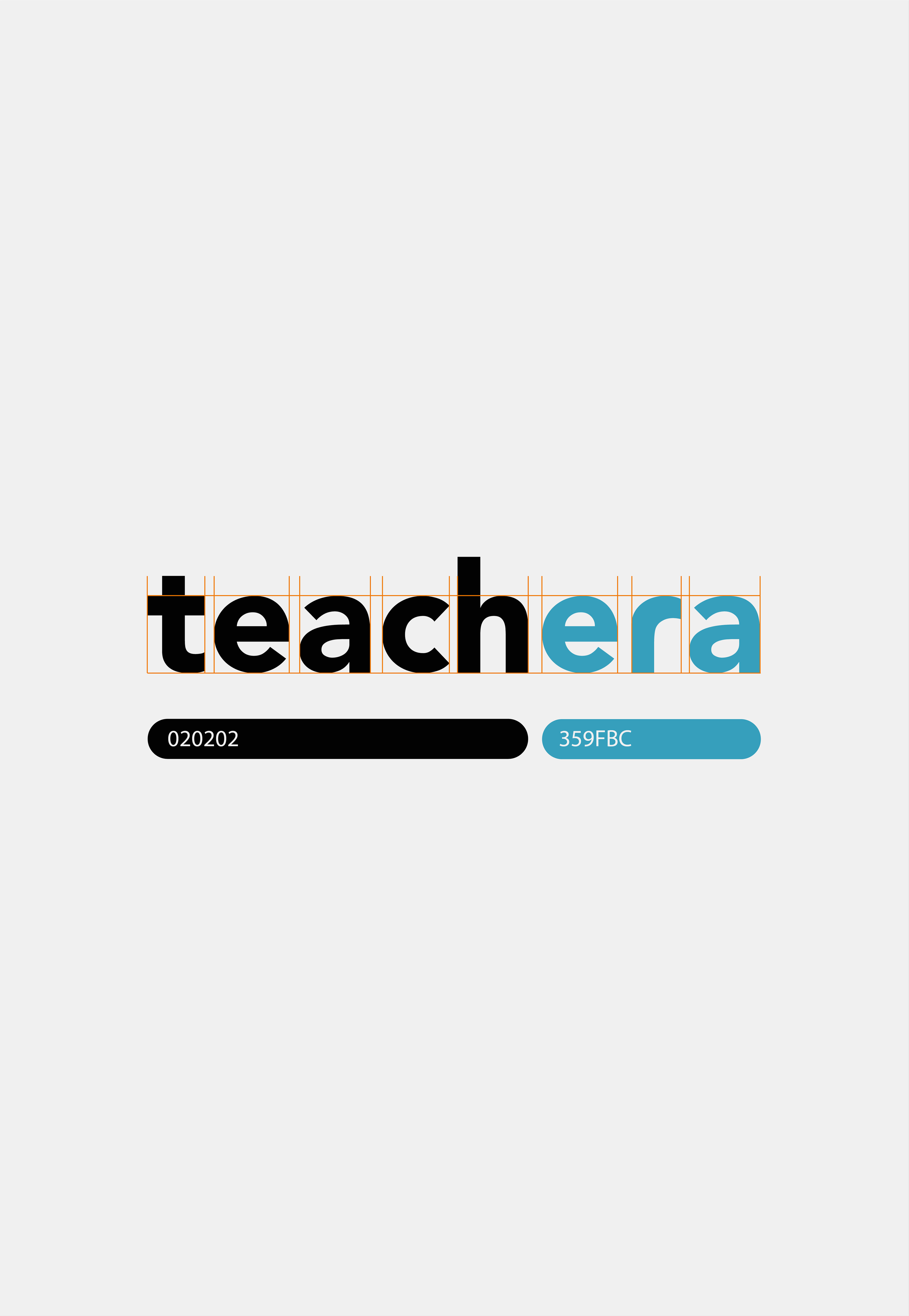
Blue
In the context of Teachera, which is an innovative online education platform, the use of blue can have several benefits for the UX. Blue is often associated with feelings of trust, reliability, and stability. By incorporating blue into its branding, Teachera can convey a sense of trustworthiness and dependability to its users. This can be particularly important for an online education platform, where users may be hesitant to trust an unfamiliar service with their personal information and educational needs. Blue is a calming color that can help create a sense of focus and concentration. This can be especially beneficial for an online education platform, where users may be prone to distractions and interruptions. By using blue, platform can help users maintain their focus and stay engaged with their studies. Also, blue is a versatile color that can be used in a variety of shades and tones to create different moods and effects. For example, darker shades of blue can create a sense of professionalism and sophistication, while lighter shades can be more calming and approachable. By using a range of blue tones in its branding and design, Teachera can create a dynamic and engaging user experience that adapts to the needs and preferences of its diverse user base. By leveraging the psychological and emotional associations of this color, Teachera can establish a strong brand identity that resonates with its users and sets it apart from its competitors.
Orange
Adding orange on graphic elements to complement brand's colors is a strategic move. Orange is a vibrant and energetic color that can add excitement and enthusiasm to a brand's visual identity. By incorporating orange into the brand's color scheme, Teachera can create a more dynamic and engaging presence that captures attention and stands out from competitors. Orange convey a sense of warmth and friendliness. This is especially beneficial for brand, which aims to cultivate a more approachable and humanized image. Orange becomes a powerful tool for creating contrast and visual interest in design. When used in combination with blue, it can create a sense of balance and harmony that draws the eye and makes the brand's message more memorable. Psychologically orange color is also associated with creativity and innovation, communicate a sense of innovation, cutting-edge thinking and helps to support this message.
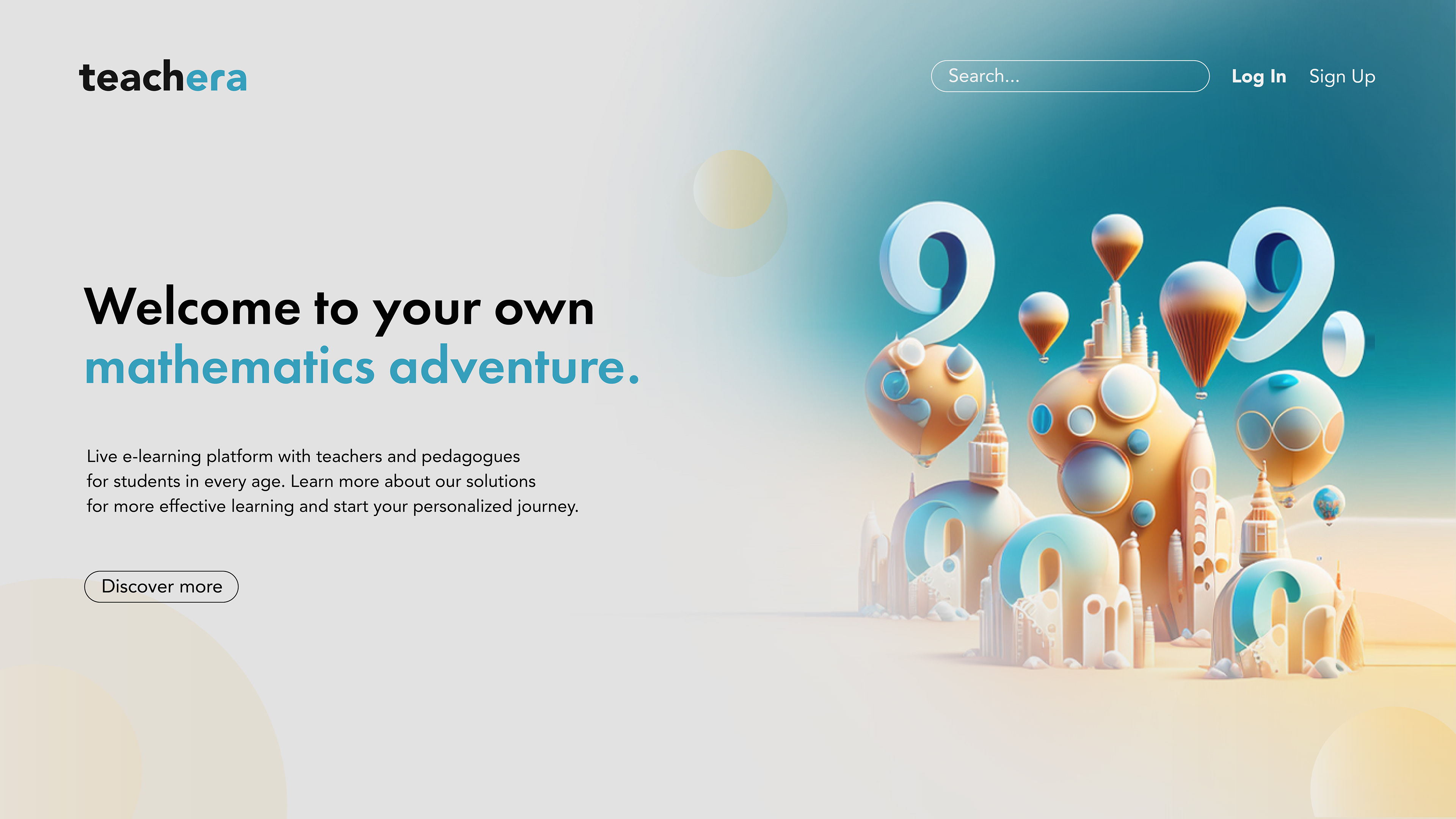
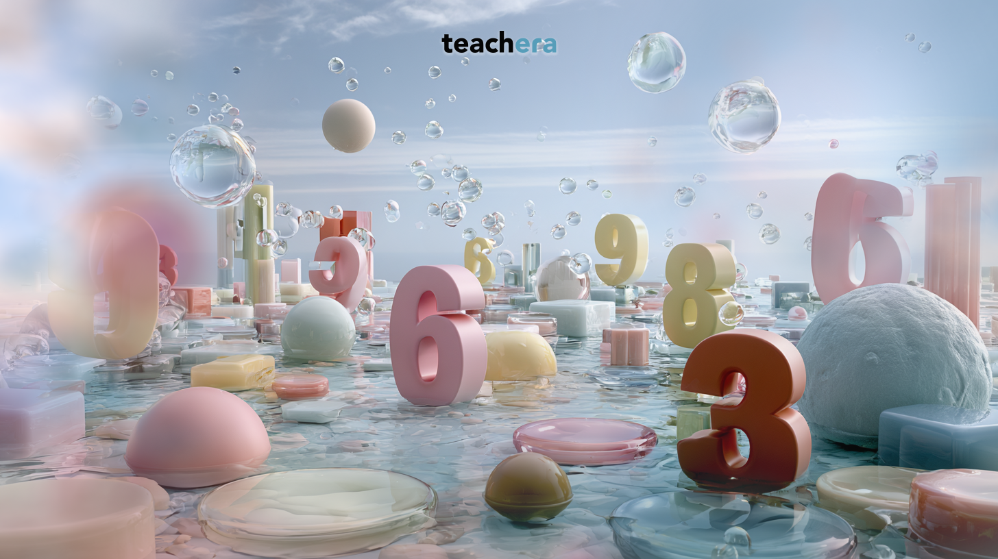
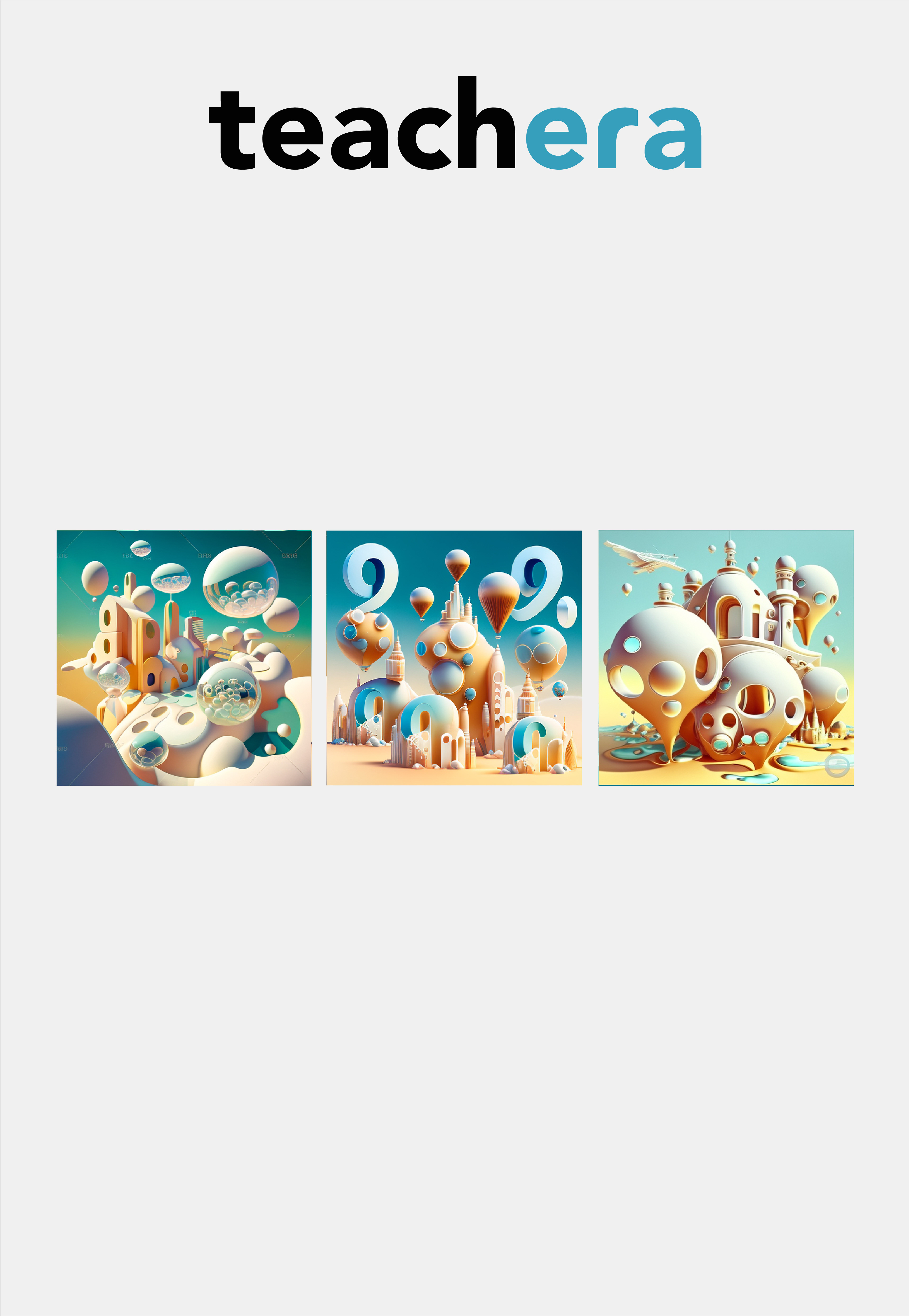
Visuals
To showcase a fantasy mathematics world I decide to use AI-generated images that can elevate the UX of Teachera by creating a visually engaging fantasy environment. By leveraging the power of AI and machine learning, Teachera can provide learners with original visual experience, which match with brand idea of treating learning as an adventure.


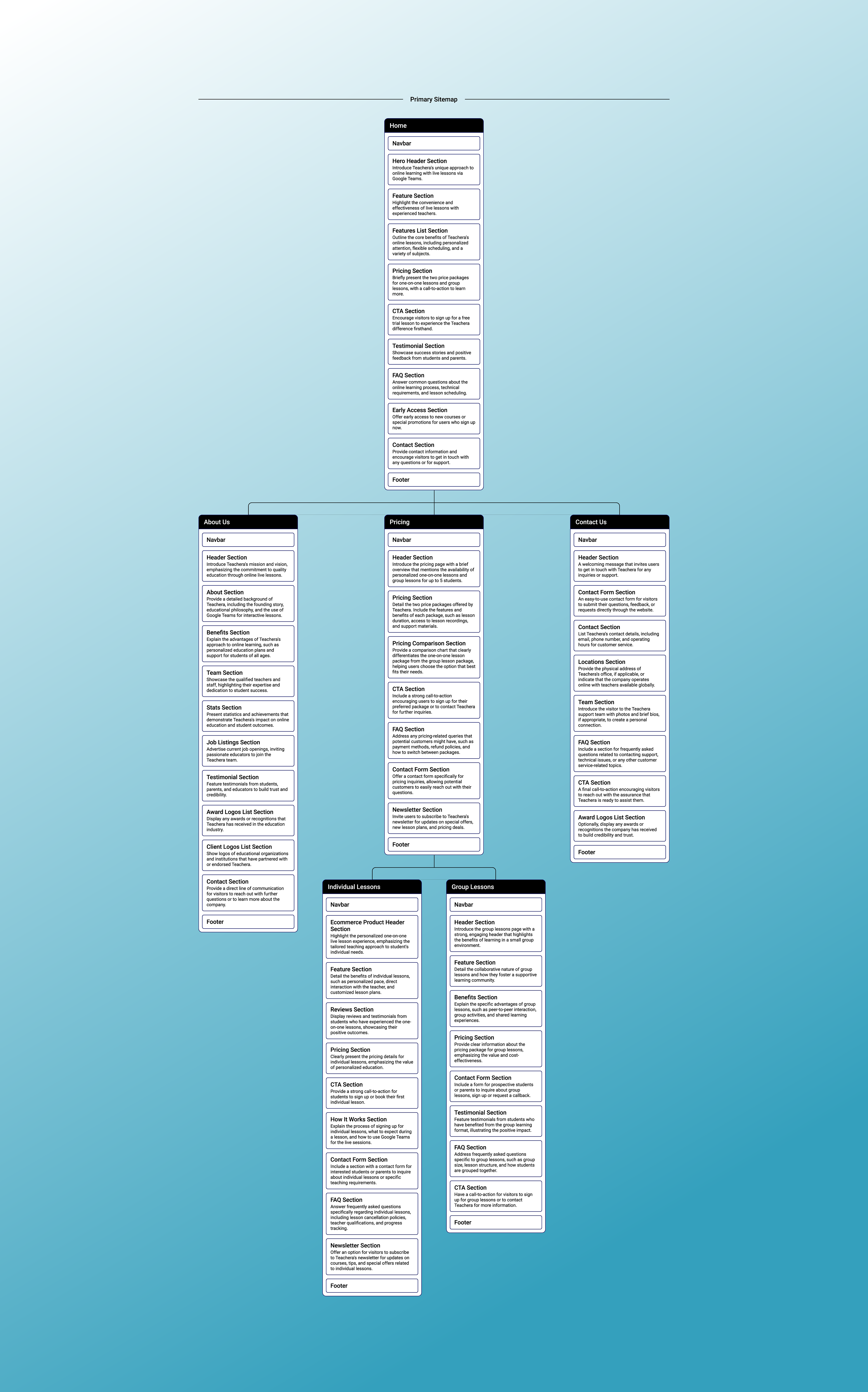
Website design
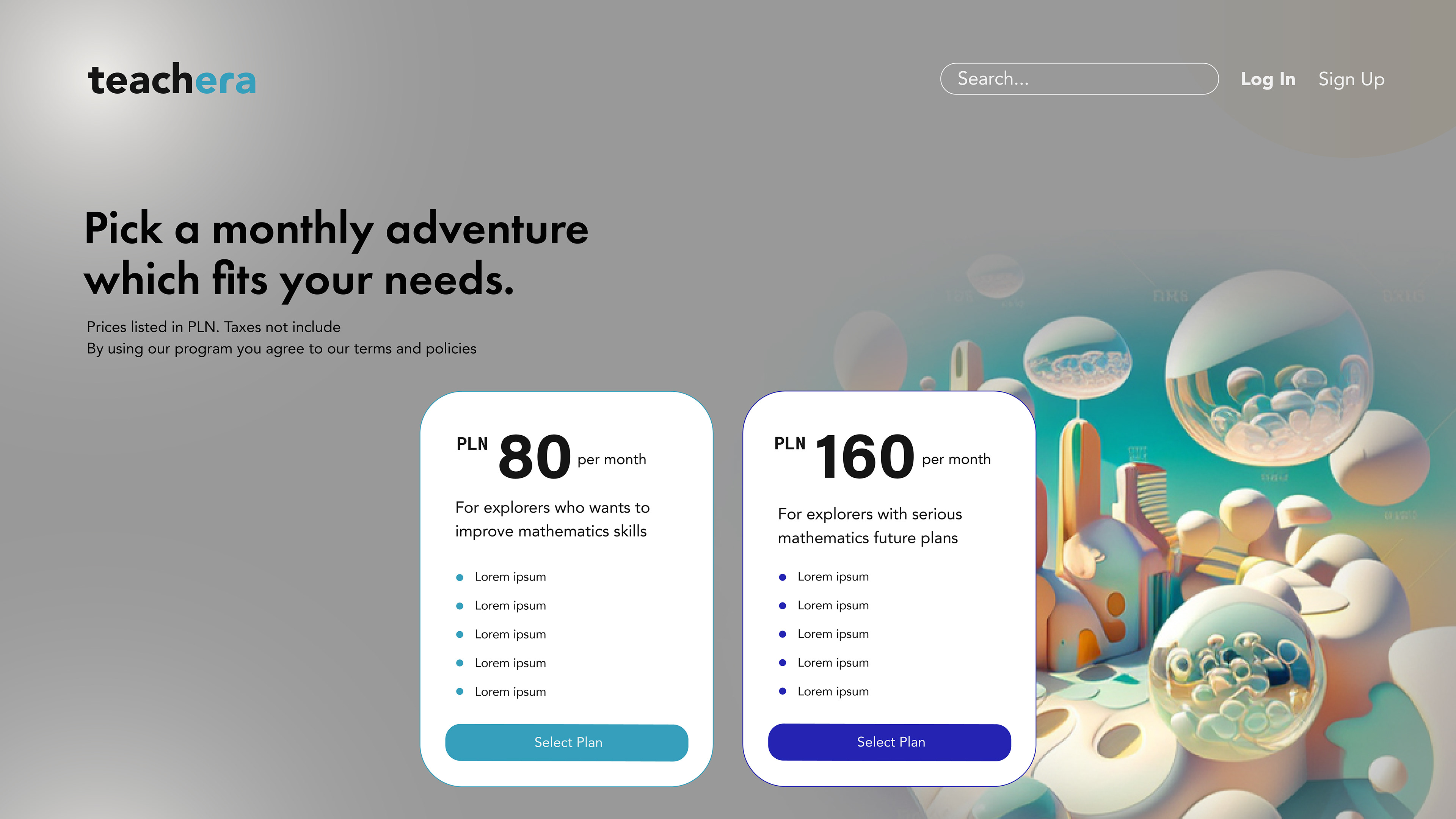
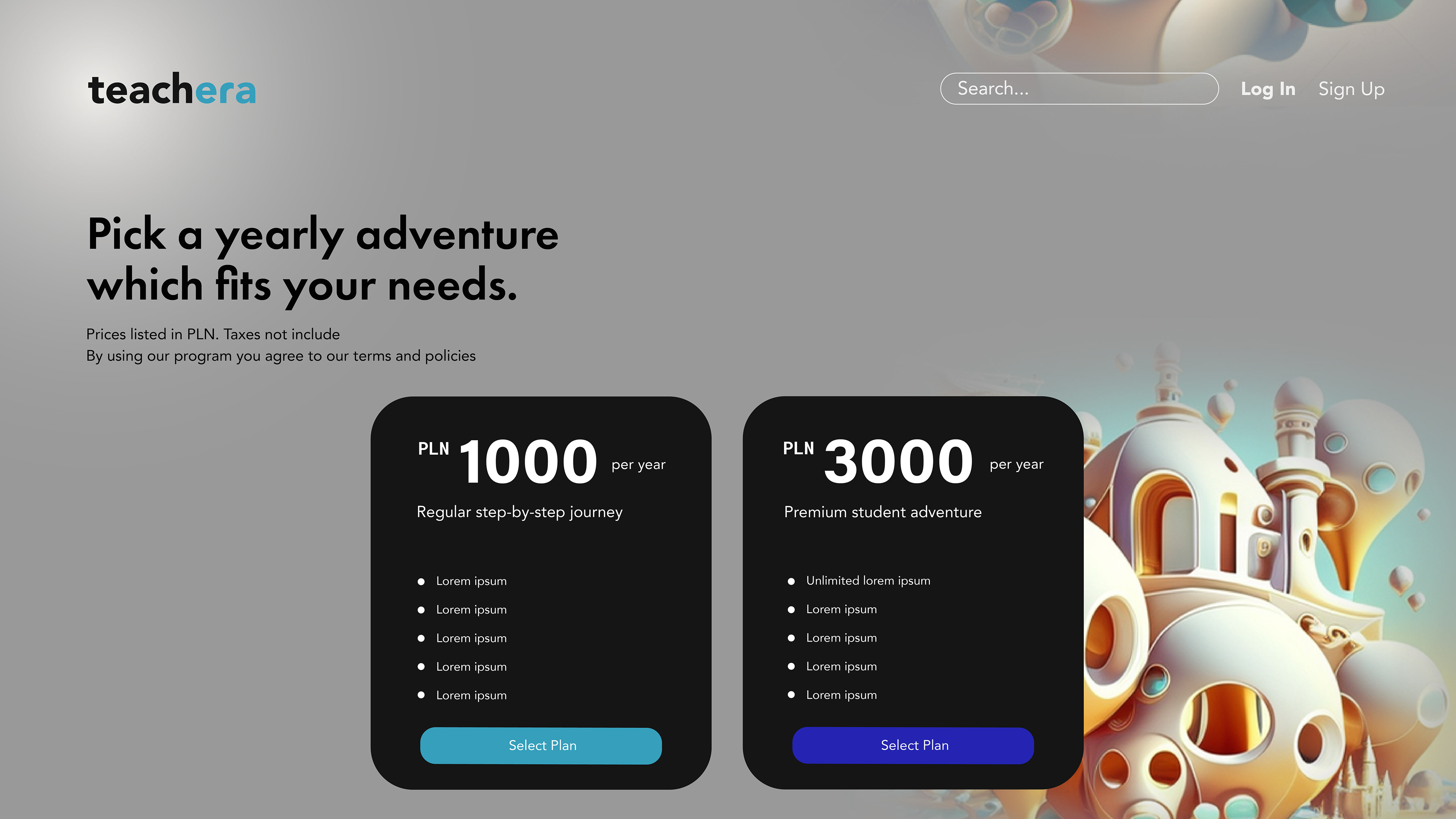
Website style is designed to provide a seamless user experience with a clean and modern aesthetic that reflects the company's commitment to innovation and education, but adding dreamy accent of gradients to make it more original and game-imitating. The page features clear Navigation and a prominent Search bar, allowing users to easily find the resources they need, while also showcasing its offer.
The use of color and typography is carefully chosen to enhance readability and guide the user's eye towards important information, such as descriptions and pricing.

Print
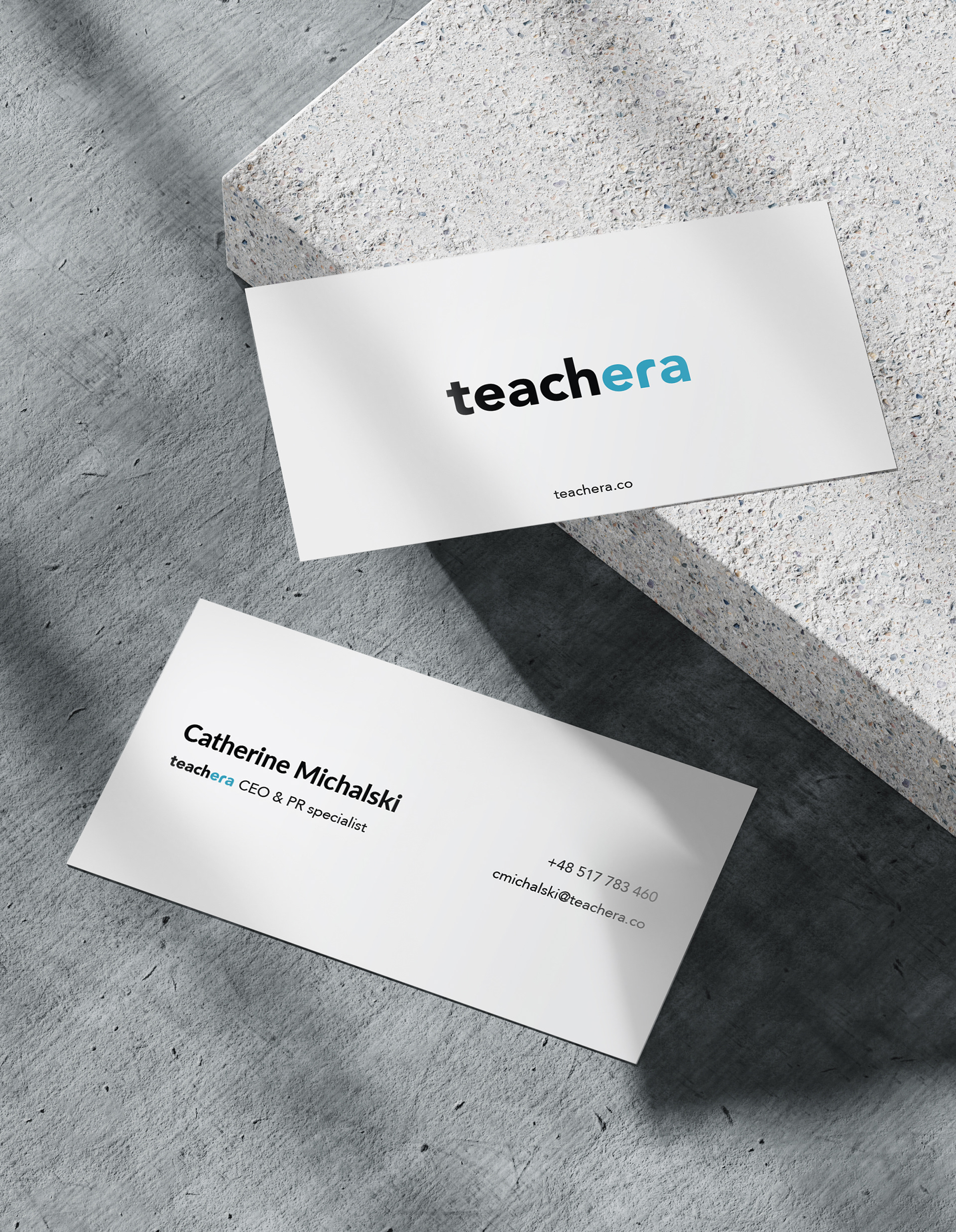
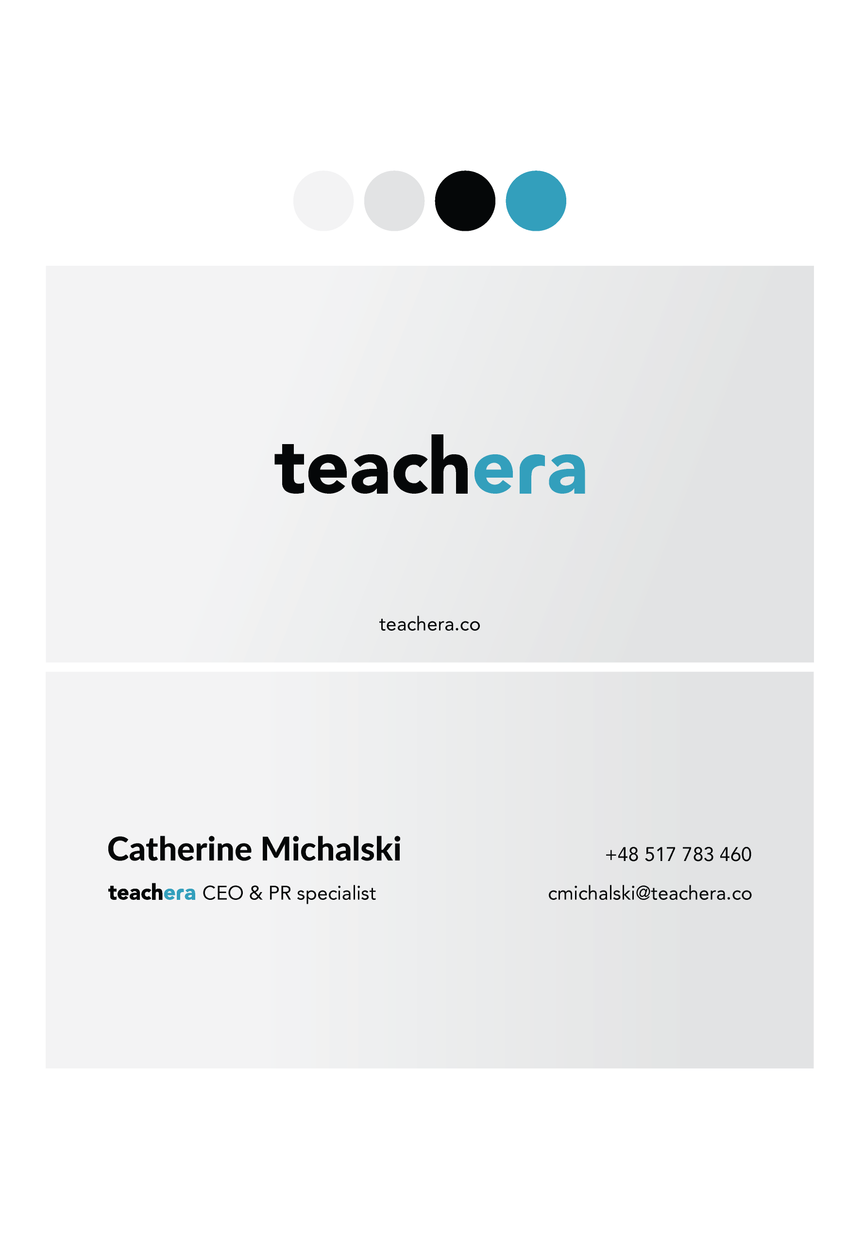
Minimalist business card design is intended to provide a clean, professional look that aligns with brand identity, with key information such as the company name, contact information, and logo, all clearly displayed in an easy-to-read format that maximizes the use of negative space, resulting in a visually appealing and functional design.
The visual identification motif becomes a symbol of the brand
The balloon is associated with lightness, fun and dreams. It is a physical object that we use in brand communication in an unconventional way. It has a classic form, but also the form of numbers. The balloon appears on the brand's visuals, but also physically during marketing communication activities.


Social media content
All images are generated with AI that is related to the brand but can also show its visual possibilities in content creation. Button form refers to everyday technology and ease of use.